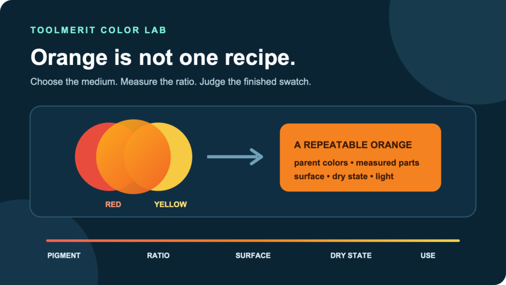
A medium-specific guide to mixing, adjusting, diagnosing, and recording orange instead of relying on one universal recipe.
For paint, red and yellow make orange. Start with equal parts, then add yellow for a lighter, yellower orange or red for a deeper, redder orange. Orange-leaning parent colors usually take a shorter route to a clean orange than violet- or green-biased alternatives. On a screen, use RGB rather than a paint recipe; the CSS named color orange is #FFA500, or rgb(255, 165, 0).
That is the short answer, but equal parts is only a starting sample—not a universal formula. Paint names do not reveal tinting strength, opacity, undertone, or pigment load. Golden Artist Colors notes that red and yellow make orange on the artist’s color wheel, while the particular red and yellow can dramatically change the secondary mixture. The useful method is therefore to mix a small ratio ladder with the materials you actually have, judge it after the relevant drying or curing time, and preserve the winning recipe.
Mix a three-swatch orange ladder before chasing the final color
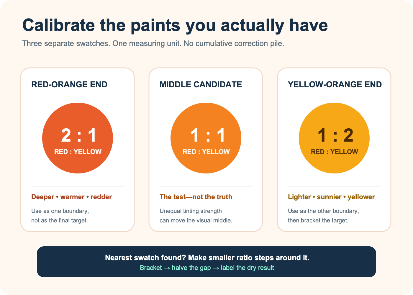
Do not keep correcting one growing pile. Make three separate samples with the same measuring unit: a palette-knife tip, equal-size drop, weighed fraction, or another repeatable amount suited to the material. Keep the paint brand, product line, surface, and application thickness constant.
| Starter swatch | Red | Yellow | What it reveals |
|---|---|---|---|
| Red-orange end | 2 parts | 1 part | How deep and red the pair can go without another color |
| Middle candidate | 1 part | 1 part | Whether equal physical amounts look visually balanced |
| Yellow-orange end | 1 part | 2 parts | How bright and yellow the pair can go before reading as yellow |
The visible middle may not be the 1:1 sample. One pigment can dominate another; Golden’s guide specifically warns that professional colors have unequal tinting strengths. If the equal-parts sample still looks red, use the 1:2 sample as the new center and create two smaller steps around it—for example, 1:1.5 and 1:2.5. This is a bounded search: bracket the target, then halve the gap instead of making random additions.
Choose parent colors by undertone, not just the label
“Red” and “yellow” are families, not fixed ingredients. A scarlet or other orange-leaning red usually takes a shorter route to a familiar orange than a violet-leaning crimson. A middle or warm yellow often reaches a warm orange more directly than a greenish lemon yellow. Those are selection clues, not guarantees: actual pigments behave differently, so test the pair rather than trusting the front label.
Make an undertone strip before mixing. Pull each parent paint thinly over white so its less-concentrated color is visible. Ask two questions:
- Does the red lean toward orange, or does it move toward violet or magenta?
- Does the yellow lean toward orange, or does it move toward a cool greenish yellow?
For a bright, conventional orange, begin with the parents that already face each other across the smallest hue distance. For a dusty, floral, earth, or sunset orange, the less-direct pair may be exactly what you want. “Clean” means close to the chosen target, not objectively better.
Selection rule: choose the parent colors whose undertones already point toward the orange you want, then let the three-swatch ladder show the real ratio.
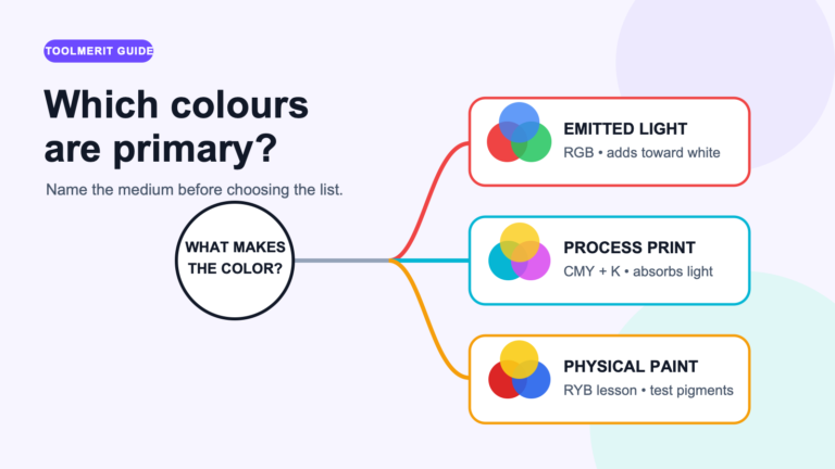
Before selecting the parent colors, use the primary-color systems guide to confirm whether the job is paint, screen light, or print ink.
Control lightness and intensity separately from hue
Red-versus-yellow mainly moves the mixture around the orange hue family. It does not independently control how light, pale, muted, transparent, or opaque the result is.
- To make a yellow-orange: add yellow in small measured increments.
- To make a red-orange: add red in smaller increments if that red has high tinting strength.
- To make a tint or peach: first establish the orange hue, then move a sample into white. Do not pour white into the only saturated mixture.
- To reduce intensity: introduce a pinprick of blue, orange’s traditional complement, or a neutral gray of similar value. Stop early.
- To make a transparent wash: use the medium or water permitted by that paint system rather than substituting white, which changes the color into a tint.
Golden’s mixing guidance says a complement reduces chroma and that titanium white changes coverage as well as value. If the real target is an earthy brown rather than a muted orange, the separate guide to three reliable brown-mixing routes explains why orange plus blue is one controlled path—not a rescue move to perform blindly.
Correct the orange with one controlled move
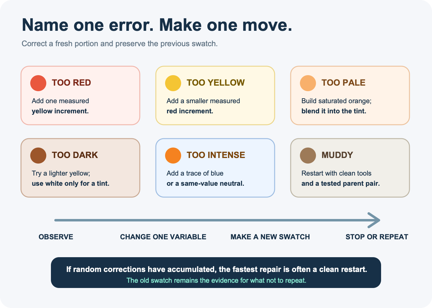
Before correcting, place the dry or settled sample next to the target on the same background. Name one directional error. Make the next adjustment in a fresh portion, record it, and keep the old swatch as evidence.
| What you see | Likely issue | Next controlled move | Avoid |
|---|---|---|---|
| Too red | Red-to-yellow ratio is high | Add one measured yellow increment | Adding white, which changes value instead of fixing hue |
| Too yellow | Yellow-to-red ratio is high | Add a smaller measured red increment | A full equal part of a strong red |
| Too pale | Too much white or opaque light base | Build a saturated orange separately, then blend it in | Adding red alone and turning the tint pink |
| Too dark | Dark parent, complement, or excessive layer | Test a lighter yellow; add white only if a tint is acceptable | Assuming more yellow always preserves saturation |
| Too intense | Target needs lower chroma | Add a trace of blue or a same-value neutral | Black as the first correction |
| Muddy without intending it | Parent undertones, contamination, or too many corrections | Restart with clean tools and a tested parent pair | Continuing to feed the same pile |
A muddy orange is not automatically “wrong.” It may be the correct low-chroma color for skin, terracotta, foliage, or an aged print. The repair applies only when the target was a clearer orange and the mixture arrived elsewhere.
Use a different recipe for paint, print, and screens
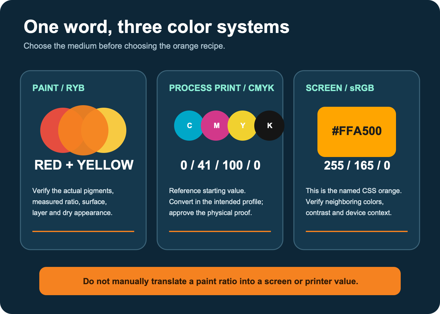
The phrase “what colors make orange” changes meaning with the medium. Adobe’s color-wheel guidance separates RYB for traditional painting, RGB for screens, and CMYK for print. Carrying a paint answer into a web file—or a screen value into a printer without conversion—is a category error.
| Medium | Useful starting answer | What must be verified |
|---|---|---|
| Artist or craft paint | Red + yellow; calibrate with the three-ratio ladder | Actual pigments, opacity, surface, layer, and dry appearance |
| Screen / CSS | #FFA500 or rgb(255, 165, 0) for the named CSS orange | Color management, neighboring colors, and contrast in the interface |
| Process print | CMYK 0/41/100/0 as Adobe’s reference starting value | Document profile, printer, ink, paper, finish, gamut conversion, and physical proof |
The W3C CSS Color specification defines the named sRGB orange as #FFA500. Adobe publishes the same screen value and a CMYK reference of 0% cyan, 41% magenta, 100% yellow, and 0% black. That CMYK tuple is not a promise that every press and paper will match the screen. Adobe’s Photoshop guidance explains that some RGB colors are outside a print gamut and must be converted to a closest printable equivalent.
Use the site’s design and graphics tools collection when you need to build, sample, or inspect a digital palette. If the orange belongs in a logo or illustration master, understanding how vector images store editable fills and shapes helps you preserve one specified color instead of recoloring exported screenshots.
For the print branch, the CMYK print-mixing guide makes the subtractive model explicit before you set the orange values.
Test the orange in the job it must perform
A swatch can be correct in isolation and fail in context. Compare paint only after the relevant dry or cure stage, on the intended surface, under the important light. Golden notes that transparent acrylic colors can shift as their milky wet emulsion clears during drying. A thin white card test is useful for diagnosis, but it does not replace a sample on canvas, wood, wall, fabric, clay, or the actual coated stock.
For interfaces, verify function as well as hue. Using the WCAG relative-luminance calculation, exact #FFA500 has approximately 10.63:1 contrast with black and 1.97:1 with white. WCAG 2.2’s minimum is 4.5:1 for normal text and 3:1 for large text, so black text passes those thresholds on that exact orange while white text does not. Recalculate whenever the orange or text color changes.
Scale matters too. A vivid orange mark that works on a poster may blur into its neighbors at tab size. The favicon testing workflow shows how to check a branded color and silhouette at the tiny sizes browsers actually display.
Record the dry swatch, not the memory
Once a sample works, give it a reproducible record. “Two blobs of red and one of yellow” is not enough if the blobs, materials, or surface can change. Capture:
- brand, product line, exact color names, and pigment codes when supplied;
- ratio and measuring method, including whether it is by mass, drop, or consistent tool load;
- medium or dilution and mixing order;
- substrate, ground color, application tool, and layer thickness;
- wet appearance and dry or cured appearance after a stated interval;
- viewing light or, for digital work, the color space and numeric value;
- the final one-variable correction that produced the accepted sample.
Keep the physical swatch with the record when repeatability matters. For a cross-channel brand, place the approved paint reference, sRGB value, print specification, usage notes, and file masters in the same controlled library. The brand asset tools collection is the relevant next step when one orange must survive handoffs across designers, vendors, and formats.
Use premixed orange when mixing adds unnecessary uncertainty
Mixing is useful when you need a particular hue from an existing palette, enjoy visible variation, or want to learn how the parents interact. A premixed orange can be the better tool when you need a stable high-chroma base, repeated batches, a known pigment specification, or fewer variables. Winsor & Newton describes its Winsor Orange as a consistent alternative to mixing red and yellow within that watercolor line.
Premixed does not mean universal. Check the exact product’s pigment, opacity, lightfastness information, binder, and compatibility with the rest of the system. You can still move it toward yellow-orange or red-orange with controlled additions.
Choose the route with this decision rule
- Mixing physical paint? Start with red plus yellow, build the 2:1 / 1:1 / 1:2 ladder, and refine around the nearest dry swatch.
- Getting a dull result? Clean the tools, inspect the parent undertones, and restart before adding more colors.
- Trying to mute a correct orange? Add a trace of its complement or a suitable neutral to a separate sample.
- Designing for a screen? specify an sRGB value; use #FFA500 only when the named CSS orange is actually the target.
- Preparing print? begin with a CMYK conversion in the intended profile and approve a physical proof.
- Repeating the result later? preserve the material names, measured ratio, surface, dry state, viewing condition, and accepted swatch.
If the destination is a website, preserve the approved numeric orange with the CSS property and value guide instead of sampling it again from an exported image.