A medium-by-medium explanation of RGB light, CMY/CMYK printing and traditional RYB painting, including mixture outcomes, gamut limits and practical choices.
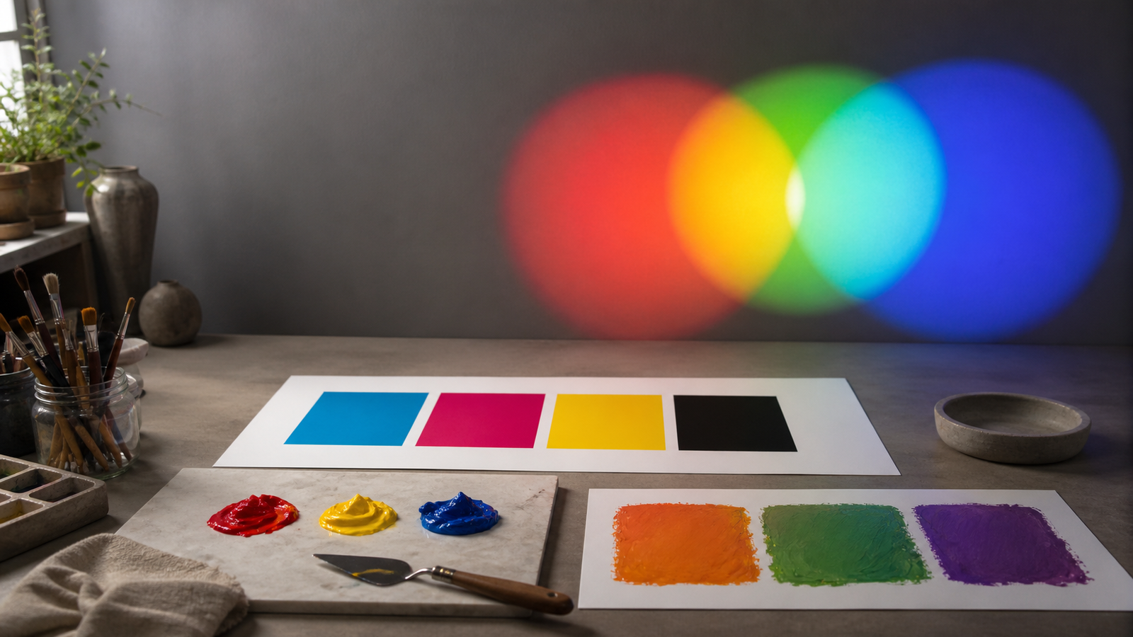
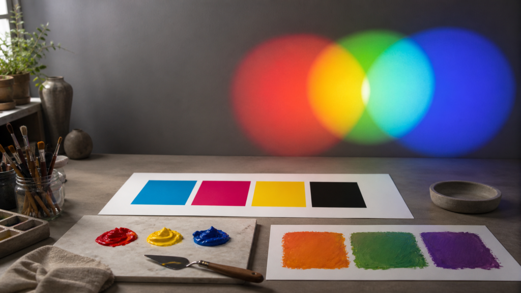
Ask a painter, a lighting technician and a printer for the primary colors, and all three may give different answers without any of them making a simple mistake. They are starting with different materials and different ways of producing what the eye sees.
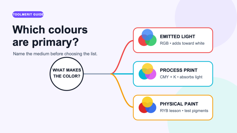
The primary colors depend on what is being mixed. For emitted light and screens, they are red, green, and blue (RGB). For ideal subtractive mixing and process printing, the colorants are cyan, magenta, and yellow, with black added in CMYK printing. Traditional introductory painting uses red, yellow, and blue (RYB). None is the single universal set; each belongs to a different model and produces a limited range of colors.
The short answer depends on the medium
| Task | Working primaries | Mixing behavior |
|---|---|---|
| Screen, projector, LED or stage light | Red, green, blue (RGB) | Additive: more light is added; all three at full intensity approach the system’s white |
| Process printing | Cyan, magenta, yellow, plus black (CMYK) | Subtractive: inks absorb portions of white light reflected by paper |
| Idealized subtractive demonstration | Cyan, magenta, yellow (CMY) | Pairs ideally produce red, green and blue; all three absorb broadly |
| Traditional introductory art wheel | Red, yellow, blue (RYB) | A practical historical teaching model for paint and color relationships |
If a school worksheet asks for “the three primary colors” in an art lesson, RYB is probably the expected answer. If the question concerns a phone display or CSS color, use RGB. If a commercial printer requests separated artwork, CMYK is the relevant process model. Context completes the answer.
Three primary-color systems solve different jobs
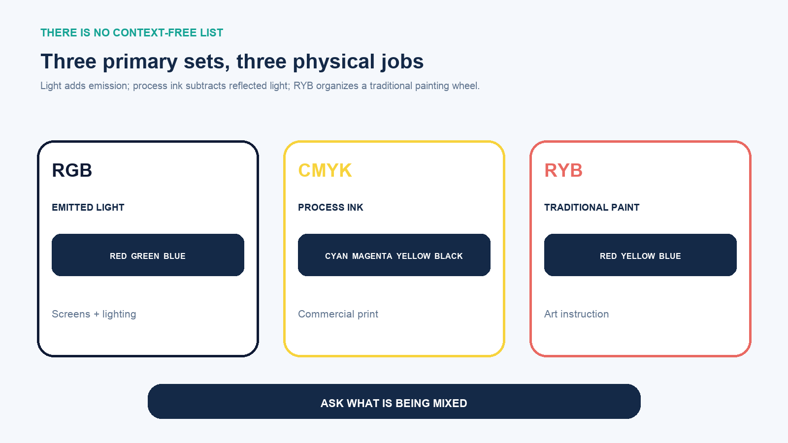
A primary is a chosen component from which a system builds or represents other colors. The choice depends on the intended range, the behavior of the emitters or colorants and the viewing conditions. It is not a declaration that the color exists in nature as an indivisible essence.
That is why modern color work includes many spaces beyond one classroom wheel. The W3C’s current CSS Color specification includes sRGB, Display P3, A98 RGB, ProPhoto RGB, Rec. 2020 and device-independent coordinates. These RGB spaces all have red, green and blue components, but their precise primaries and reproducible gamuts differ.
RGB primaries add emitted light
In an additive system, the starting point is darkness. A display or light fixture emits controlled red, green and blue components. Increasing a component adds light. In the simplified RGB mixture:
- red + green produces yellow;
- green + blue produces cyan;
- blue + red produces magenta;
- red + green + blue at the system’s reference levels produces a neutral white.
A digital RGB triplet is meaningful inside a named color space. In conventional 8-bit sRGB notation, each channel often ranges from 0 to 255, so rgb(255 0 0) represents maximum red with no green or blue. Equal channel values produce a neutral gray within that encoding. The same numerical triplet in another RGB space is not guaranteed to describe exactly the same physical stimulus.
RGB does not imply that a screen reproduces every color humans can see. Its three primaries form a gamut—a bounded range. A wide-gamut display may reach colors that an sRGB display cannot, even though both are described as RGB.
CMY primaries subtract from reflected light
Ink on white paper does not usually emit colored light. White illumination reaches the paper; colorants absorb parts of the spectrum; the remaining light returns to the eye. Adding ink therefore removes, or subtracts, more of the available light.
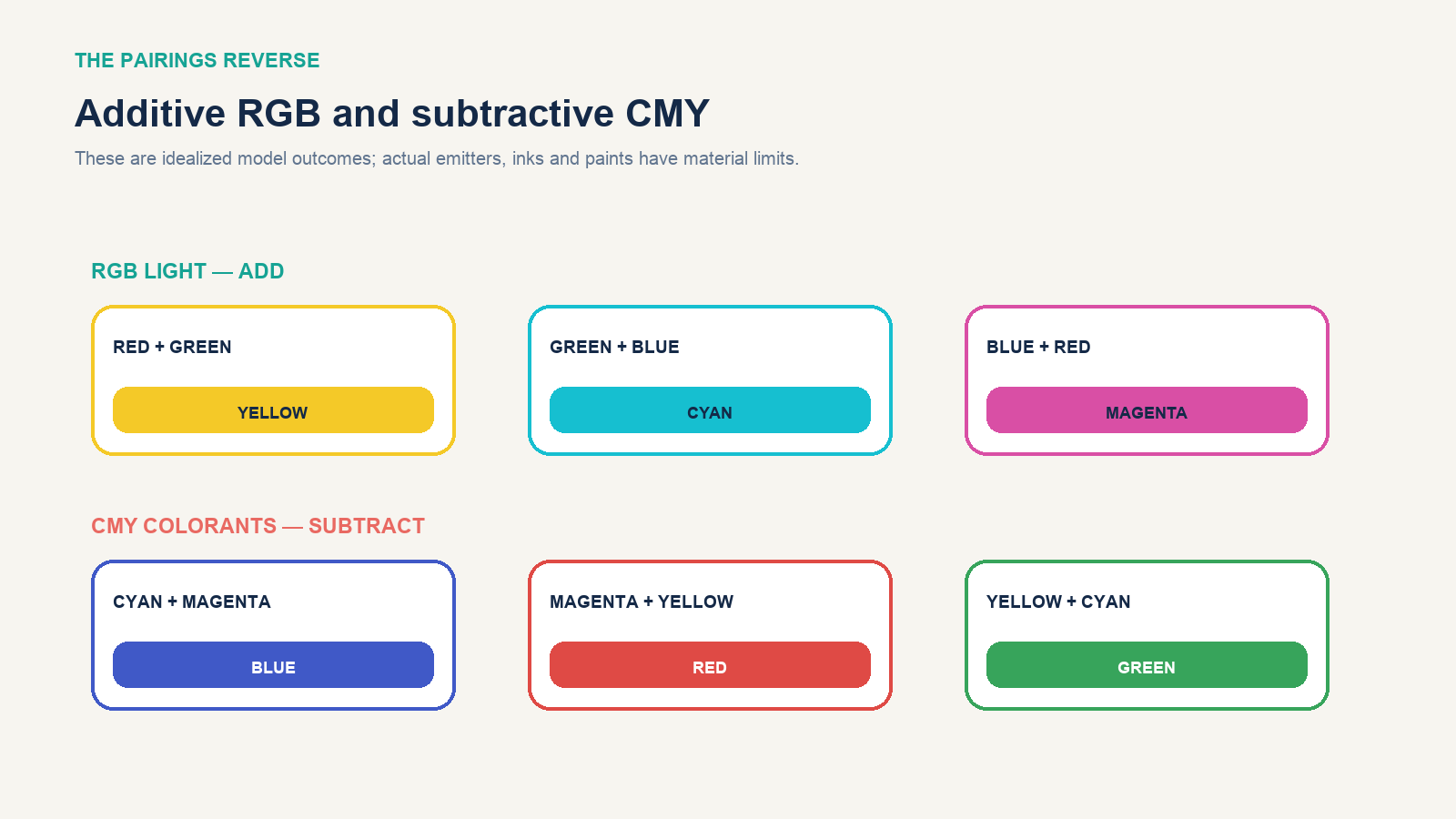
- cyan + magenta ideally produces blue;
- magenta + yellow ideally produces red;
- yellow + cyan ideally produces green.
Real process printing uses CMYK, adding black (K). Adobe explains that cyan, magenta and yellow theoretically absorb toward black, but printers add black ink to improve shadow depth and detail. Black also supports practical neutral control and production efficiency. CMYK values are commonly expressed as percentages of the four process inks.
A vivid screen color may fall outside a printer’s gamut. Converting an RGB design to CMYK is not a clerical relabeling of the primaries; it maps colors into a different reproduction system. Paper, ink set, press condition, profiles and lighting all affect the result.
What changes when an RGB design goes to print?
An RGB file can describe intense blues, greens and other colors that a particular CMYK press-and-paper combination cannot reproduce. During a color-managed conversion, the source profile defines what the RGB numbers mean, while the destination profile describes the printer’s reproducible range. The conversion then chooses printable replacements for out-of-gamut colors. That is why simply changing a document’s mode can make a bright screen palette appear duller: the preview is showing a smaller physical gamut, not removing color arbitrarily.
For a print job that matters, use the printer’s requested output profile and view a soft proof before approving the file. Turn on an out-of-gamut warning if the design application provides one, then adjust the few critical colors instead of globally increasing saturation. Also inspect photographs, gradients, small reversed text and neutral grays. A color that looks acceptable on a luminous display may behave differently when four ink separations are printed on an absorbent, warm-white sheet.
The black channel deserves deliberate treatment. A small line of black text is normally more reliable as black ink alone than as a four-ink mixture that requires perfect plate registration. A large dark background may need a printer-approved rich-black recipe for visual depth. These are production decisions inside CMYK; they do not change the underlying answer that cyan, magenta and yellow are the subtractive color components and black is the practical fourth process ink.
RYB is the traditional art-teaching set
Red, yellow and blue remain the familiar primaries of many art classrooms and traditional color wheels. The National Gallery of Art uses RYB in its introductory teaching materials and contrasts it with the RGB light used by computer screens. Within the RYB wheel, the common secondary pairs are:
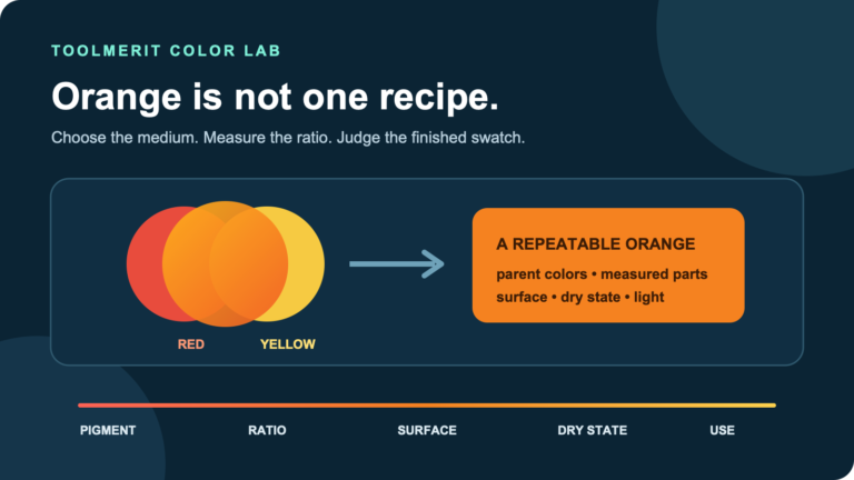
- red + yellow = orange;
- yellow + blue = green;
- blue + red = violet or purple.
This is useful for teaching hue relationships, complements and basic mixing. It is not a promise that any tube labeled red, yellow and blue can mix every visible color. Paints have particular pigments, particle behavior, transparency, undertones and spectral reflectance. A warm red and a green-leaning blue may produce a muted violet because each pigment absorbs more than the idealized wheel suggests.
Artists seeking a broader practical gamut sometimes use cyan-leaning blue, magenta-leaning red and yellow, or a split-primary palette with warm and cool versions of each hue. That does not make RYB instruction useless. It separates a conceptual wheel from the performance of an actual palette.
RGB and CMY create each other’s colors
The paired diagrams reveal a helpful symmetry: the additive secondaries of RGB are cyan, magenta and yellow, while the ideal subtractive secondaries of CMY are red, green and blue. The systems reverse because one combines emitted light and the other combines absorption.
“Add red and green to get yellow” sounds wrong only if the listener imagines red and green paint. Aim red and green light at the same surface and their combined stimulus can appear yellow. Mix typical red and green pigments and the result is often dark or brownish because both materials remove different portions of the light.
Primary does not mean universal or perfectly pure
Three primaries can reproduce colors inside their system’s gamut, not every possible visible color. Change the primaries, and the boundary changes. Even two devices using nominal RGB may have different red, green and blue chromaticities, white points, brightness and transfer functions.
Likewise, cyan is not one immutable ink and “primary red” is not one universal paint formula. Manufacturers select colorants for durability, cost, safety, opacity, lightfastness, press behavior and gamut. A label names a product color; it does not prove ideal mixing behavior.
Color perception also depends on illumination, surroundings, adaptation and observer variation. A printed swatch under warm indoor light can look different under daylight. Color management uses profiles and conversions to make device-to-device reproduction more predictable; the International Color Consortium describes this as transforming data from one device encoding, such as RGB, to another, such as printer CMYK, to reproduce the intended colors.
Test the primaries you actually own
- Label the exact paints, inks or lights; do not record only generic names.
- Create a full-strength sample of each primary on the intended surface or at the intended light level.
- Mix each pair in several ratios rather than only 1:1.
- For paint, add a controlled amount of white to each mixture so undertones become visible.
- Make a neutral attempt using all three and note whether it leans warm, cool, green, violet or brown.
- Let physical samples dry before judging; some paints and inks shift as their medium changes.
- Record the light source, paper or ground, proportions and product names so the result can be repeated.
This test is more useful to a painter than arguing over a generic wheel. It shows which oranges, greens, violets, neutrals and tints the actual palette can make.
How to diagnose a disappointing mixture
When two paints make a muddy result, the names on the tubes rarely tell the whole story. First check the pigment codes, not just marketing names such as “primary red” or “bright blue.” A red that leans toward orange already reflects a different spectral balance from a red that leans toward violet. Pairing two colors that each carry an unwanted third-primary bias tends to reduce chroma. For a cleaner violet, for example, compare a violet-leaning red with a violet-leaning blue; for a cleaner green, compare a green-leaning blue with a green-leaning yellow.
Opacity and mixing strength also matter. A highly tinting pigment can dominate a weaker one even when the physical amounts look equal. Transparent glazes can produce a different visual effect from an opaque premix because light travels through stacked layers before returning to the eye. Make incremental additions, record ratios and judge both the mass tone and a white tint. The tint often reveals an undertone that is difficult to see in thick paint.
If the problem occurs on a screen rather than a palette, verify the document color space, export profile, browser or application preview and display settings. If it occurs only in print, compare the proof under the intended lighting and confirm the correct paper and output profile were used. The same symptom—“the color is wrong”—can therefore point to a pigment choice, an unmanaged RGB file, a gamut conversion, an ink-and-paper condition or simply a different viewing light.
Which primary colors should you use?
- For a screen, website or digital UI: choose a named RGB color space appropriate to the workflow; sRGB remains a common interchange baseline.
- For commercial process printing: ask the printer for the required CMYK profile, proofing conditions, black limits and file settings.
- For a traditional art lesson: use RYB when that is the wheel being taught, while explaining that light uses RGB.
- For physical paint mixing: evaluate pigment-specific swatches; consider a cyan/magenta/yellow or split-primary palette when broader mixtures are needed.
- For moving color between devices: preserve profiles and use a color-managed conversion rather than manually substituting one set of channel numbers.
The limit is the medium. RGB is correct for additive light, CMY/CMYK for subtractive process reproduction, and RYB for a traditional artistic framework. Ask what is being mixed and what output must be produced; then the apparently conflicting lists become different tools rather than competing facts.