
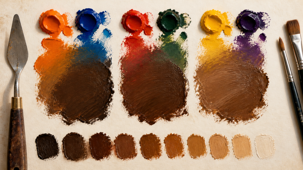
Brown comes from reducing the intensity of a warm color with its complement; the most useful starting pairs are orange and blue, red and green, or yellow and violet.
To make brown paint, mix a warm color with its complement: orange plus blue, red plus green, or yellow plus violet. You can also mix red, yellow, and blue by first making orange and then adding blue gradually. There is no universal equal-parts recipe because pigment strength and color bias vary.
For the fastest controlled test, make a generous orange pile and touch in a small amount of blue. Mix, pull out a swatch, and repeat until the orange becomes the brown you want. Keeping one color dominant is easier to control than combining three large, equal blobs.
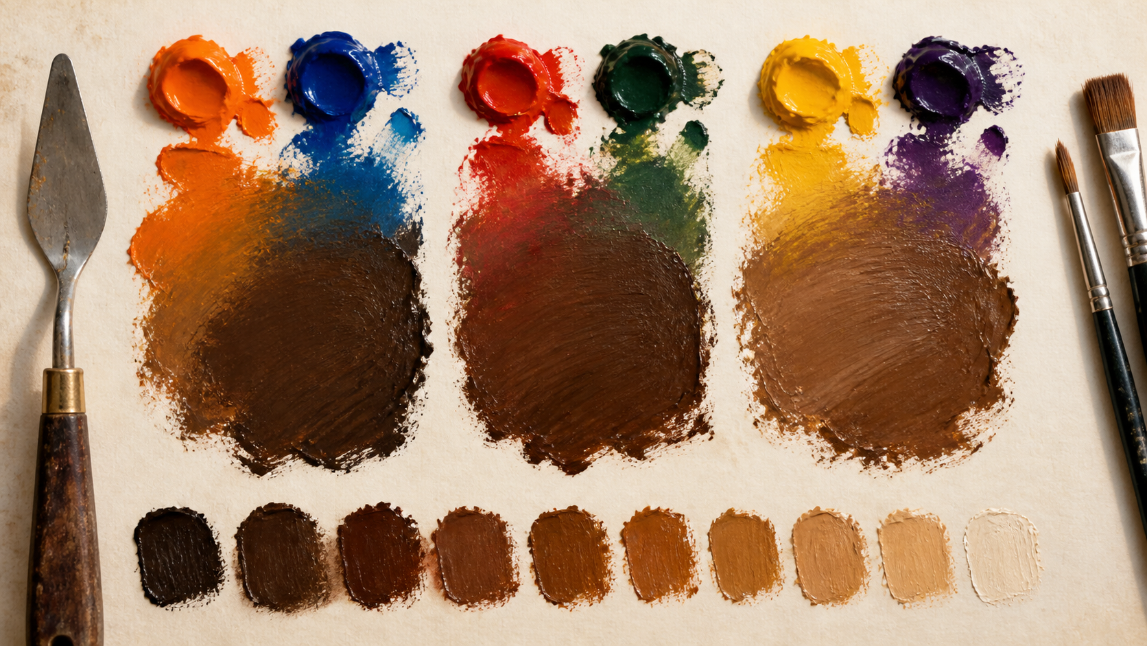
Start with one complementary pair
Brown paint is usually a dark, low-intensity warm mixture. One practical way to reach it is to begin with a color that has the warmth you want, then reduce its chroma with the color opposite it on a traditional painter’s color wheel. Artist-color references from Winsor & Newton identify the useful pairs as orange and blue, red and green, and yellow and violet.
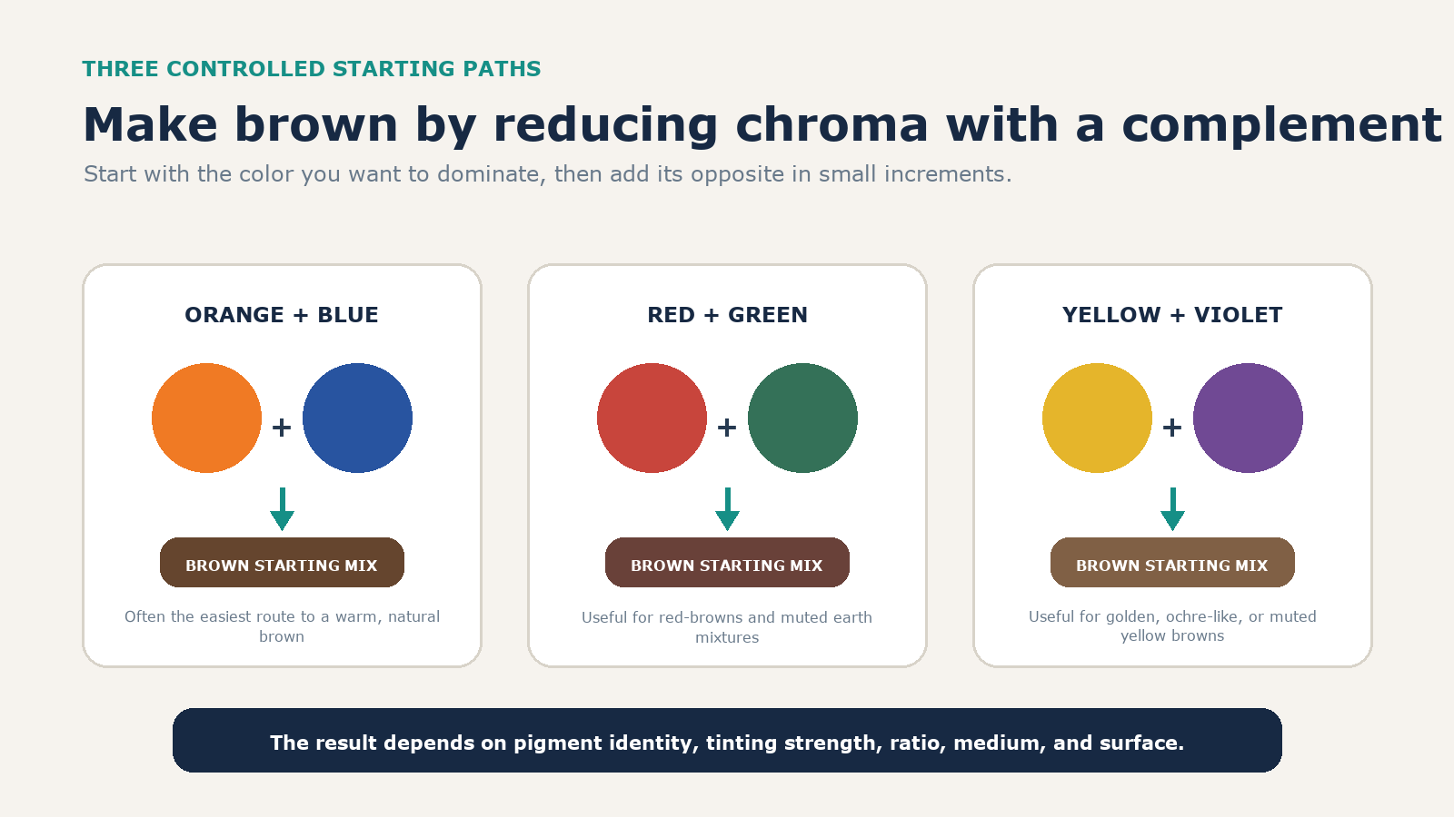
| Starting pair | Useful first target | Main control |
|---|---|---|
| Orange + blue | A conventional warm or neutral brown | Keep orange dominant; add blue sparingly |
| Red + green | A red-brown or muted earth color | Choose the red bias first, then neutralize it |
| Yellow + violet | A golden, ochre-like, or muted yellow-brown | Prevent a strong violet from overwhelming the yellow |
The labels describe tendencies, not guarantees. Ultramarine blue and phthalo blue will not behave identically. A strong green may overpower a weak red. Opaque, transparent, student-grade, and artist-grade paints also differ. The Harding University complement-mixing exercise illustrates why working ratios may land at 40/60, 50/50, or elsewhere depending on tinting strength.
Make brown from red, yellow, and blue without losing control
The familiar three-primary answer works, but adding all three at once makes diagnosis difficult. Use it as a two-stage process:
- Mix red and yellow into an orange that already leans toward the brown you want. More red makes the starting mix rustier; more yellow makes it more golden.
- Add blue with the corner of a palette knife or brush. Mix completely, then decide whether the orange still needs more neutralization.
- Stop when the mixture reaches brown. Do not continue until every trace of color disappears into gray.
This is still an orange-and-blue complement mixture; you have simply built the orange from two primaries. The same logic works if you first make green from yellow and blue and then add red, or make violet from red and blue and then add yellow.
Run a controlled mixing test
A reproducible brown comes from a swatch trail, not from memory. Prepare a white test strip and label the pigments before mixing. Then:
- Place enough of the dominant color on the palette to make the final quantity you need.
- Add a very small amount of the complement and mix thoroughly.
- Spread a thin streak on white. A thick pile can look much darker and hide the undertone.
- Reserve part of the swatch before the next addition so every step remains visible.
- Let a final sample settle or dry according to the medium, then inspect it under the light where it will be used.
- Record the pigment names and approximate ratio, not merely “blue” and “orange.”
A paint manufacturer’s mixing chart, such as the Golden Artist Colors guide, is useful for predicting relationships. Your own swatch is the final authority for the particular tubes, binder, surface, and lighting in front of you.
Adjust the brown instead of starting over
Once the mixture is recognizably brown, correct one bias at a time. Large additions create a new problem faster than they solve the old one.
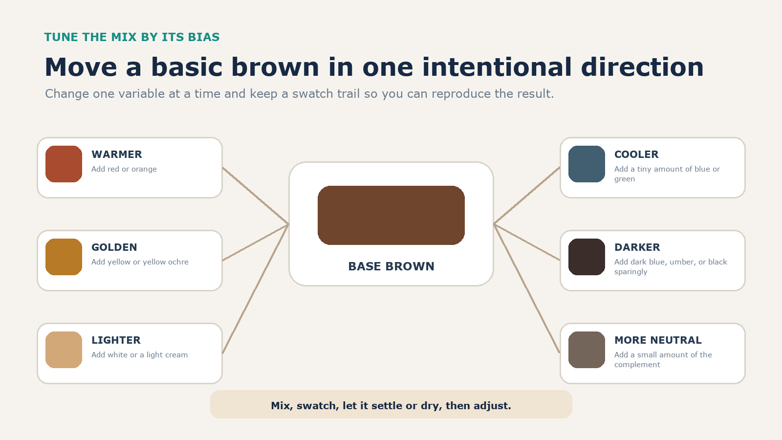
| Desired change | Add | Caution |
|---|---|---|
| Warmer or redder | Red or orange | Use the same warm pigment already in the mixture when possible |
| More golden | Yellow or yellow ochre | A cool yellow may push the mix toward green |
| Cooler | A tiny amount of blue or green | High-strength colors can dominate in one addition |
| Lighter or tan | White or a light cream | White lowers saturation and may reveal an unexpected undertone |
| Darker | Dark blue, umber, or a trace of black | Check a thin swatch before making the entire pile darker |
| More neutral | A small amount of the current dominant color’s complement | Stop before the brown turns lifeless gray |
Repair a muddy or biased mixture
“Muddy” often means the color has become more neutral than intended, not that it is objectively unusable. First spread a thin sample and compare it with the target. If it is dull gray-brown, restore a small amount of the warm color that was supposed to dominate. If it is too orange, add blue; too green, add red or orange; too violet, add yellow or yellow-orange.
Stop mixing when the hue is correct. Repeatedly sweeping every pigment together can eliminate the subtle variation that gives an earth color life. Clean the knife or brush before a correction, work on a fresh part of the palette, and limit the mixture to pigments with a known job.
If the paint looks nearly black in a pile, do not assume it needs white. Pull out a thin streak first. White is appropriate when the goal is tan or a lighter value, but it also changes chroma and can make some mixtures look chalky.
Treat digital brown as a separate problem
Screens combine emitted red, green, and blue light; paints change which wavelengths are absorbed and reflected. The University of Illinois’ explanation of additive and subtractive color mixing shows why a paint recipe should not be translated into equal RGB-channel arithmetic.
For a website or app, choose a brown coordinate and judge it in context. The W3C CSS Color specification defines the keyword brown as #A52A2A, or rgb(165 42 42). That is one standardized sRGB color, not the only correct brown.
| CSS named color | Hex value | Visual tendency |
|---|---|---|
| brown | #A52A2A |
Dark red-brown |
| saddlebrown | #8B4513 |
Deep orange-brown |
| sienna | #A0522D |
Warm medium brown |
| chocolate | #D2691E |
Brighter orange-brown |
| tan | #D2B48C |
Light muted brown |
The W3C also cautions that named colors grew from historical compatibility needs and are not an internally consistent perceptual system. For a brand palette, define explicit values, test contrast, and check the colors on representative displays. For print, use the printer’s color profile and proof; a universal CMYK conversion cannot account for every ink, paper, and press.
Judge the result after it dries and in context
Wet paint, a white palette, warm indoor light, and a neighboring bright color can all change how the same mixture appears. Apply a sample at the intended thickness to the intended surface. Let it reach its normal dry state, then view it beside the other colors in the work.
The most dependable recommendation is simple: choose one complementary pair, keep the desired warm color dominant, add the complement incrementally, and preserve labeled swatches. That method takes a few extra minutes once and gives you a brown you can make again.