
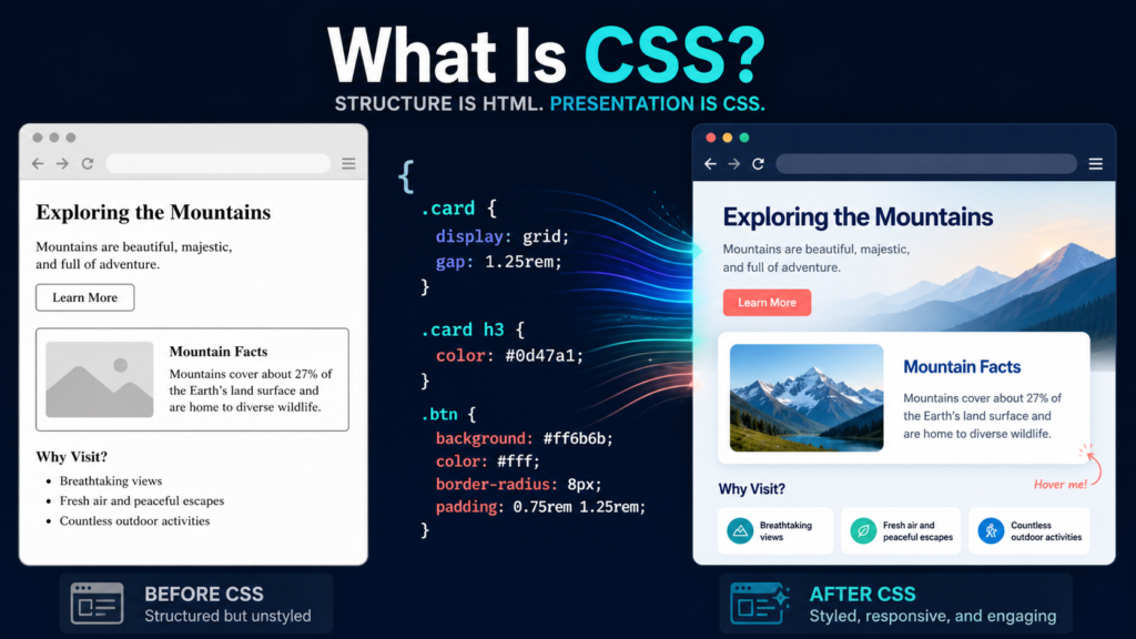
CSS is the web language that describes how structured documents are presented. It selects HTML elements, assigns visual and layout values, and resolves competing rules through the cascade.
CSS stands for Cascading Style Sheets. It is a stylesheet language that tells browsers how HTML or XML elements should be presented: colors, fonts, spacing, borders, sizing, layout, responsive changes, animation, print styling, and more. A CSS rule uses a selector to choose elements and declarations such as color: navy or padding: 1rem to assign values. When multiple rules target the same property, the cascade decides which declaration wins.
The word style can make CSS sound cosmetic. It is broader than decoration: CSS controls the visual formatting model that places boxes, adapts a page to different screens and media, and helps express states such as focus, hover, invalid input, or reduced motion.
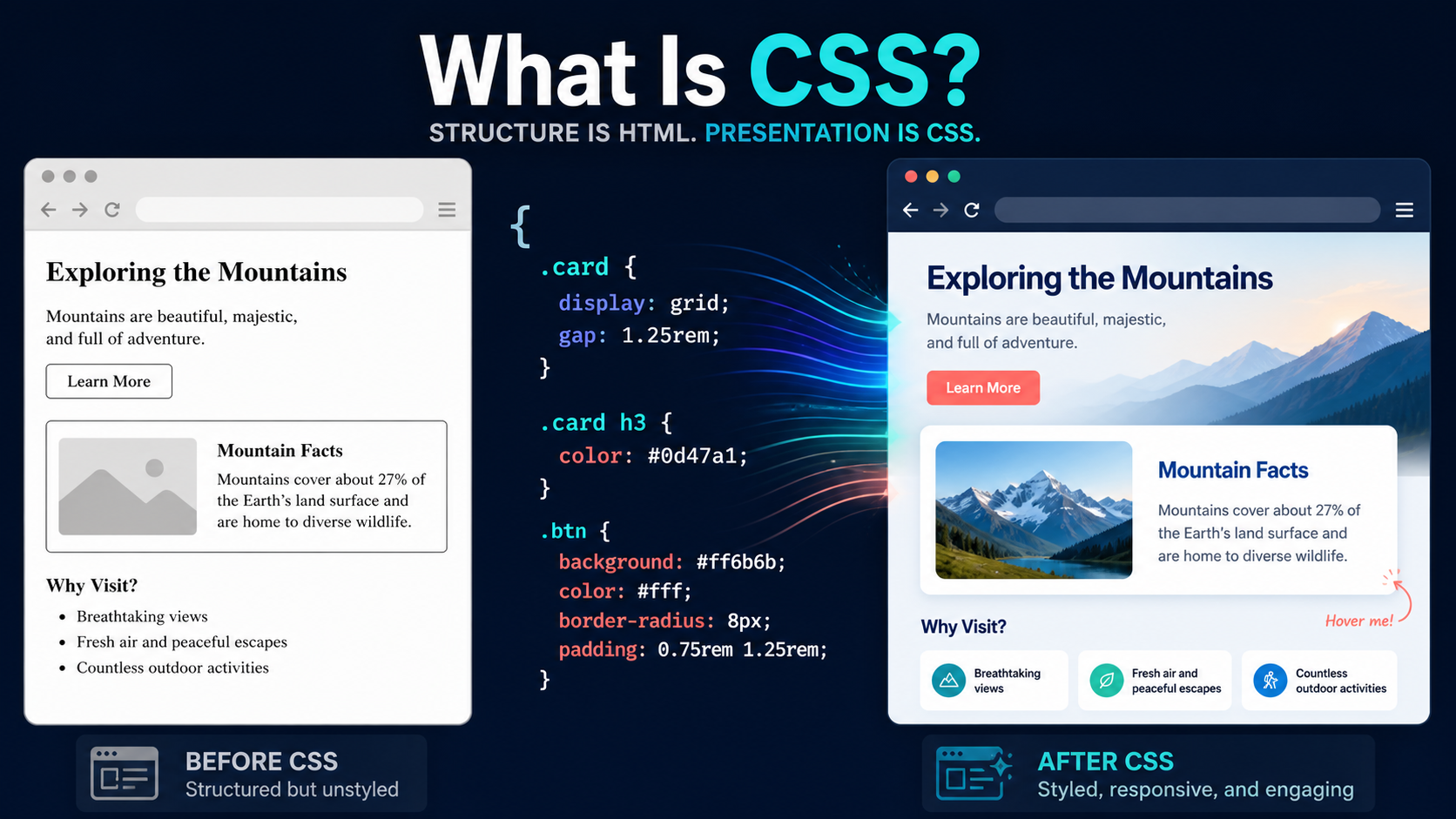
CSS changes presentation, not meaning
Imagine an article with a heading, paragraphs, a link, and a button. HTML identifies what those things are: a primary heading, a paragraph, a destination, and an action. CSS describes how they appear and behave visually. JavaScript may add changing application behavior. The three can cooperate, but they have different jobs.
The W3C CSS home page calls CSS a core language of the open web and gives fonts, colors, and spacing as simple examples. MDN’s broader CSS definition says the language describes presentation for HTML and XML documents across screen, paper, speech, and other media.
A page without author CSS is not structureless. Browsers have a default user-agent stylesheet, which is why headings are usually larger and links are underlined even before a developer adds styles. Author CSS changes those defaults while user preferences and browser rules remain part of the cascade.
Read one CSS rule
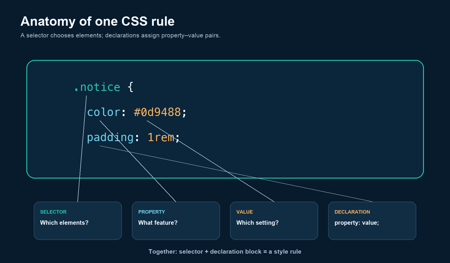
.notice {
  color: #0d9488;
  padding: 1rem;
}.noticeis a class selector. It matches elements whose class list containsnotice.- The braces contain a declaration block.
colorandpaddingare properties.#0d9488and1remare the corresponding values.- A property, colon, value, and semicolon form a declaration.
MDN’s CSS syntax guide notes that invalid property–value combinations are ignored. That error tolerance is useful, but it can also make a typo appear mysterious: the rest of the stylesheet continues while one declaration has no effect.
Style one HTML card
Start with a small HTML fragment:
<article class="card">
  <h2>Field notes</h2>
  <p>Three observations from today.</p>
  <a href="/notes">Read notes</a>
</article>
Then add CSS in a file such as styles.css:
.card {
  max-width: 32rem;
  padding: 1.25rem;
  border: 1px solid #cbd5e1;
  border-radius: 0.75rem;
  background: #ffffff;
  color: #163047;
}

.card a {
  color: #0f766e;
  font-weight: 700;
}
Connect the external stylesheet inside the document’s <head>:
<link rel="stylesheet" href="styles.css">The class selector styles the card wherever that reusable class appears. The descendant selector .card a targets links inside a card. External stylesheets normally scale better than repeating inline style attributes because many pages can share the same rules and the browser can cache the file.
How the browser turns CSS into pixels
The browser parses HTML into a Document Object Model (DOM) and styles into a CSS Object Model (CSSOM). It combines relevant information into a render tree, calculates layout—the size and position of boxes—and paints pixels. JavaScript can alter the DOM or styles and cause some of those stages to run again.
MDN’s critical rendering path documents that sequence. The practical lesson is that CSS is not an image pasted over HTML. It participates in a live rendering system: change the viewport, font, content length, state, or user preference and the computed result may change.
Why the C means cascading
More than one declaration can target the same property on the same element. CSS needs a deterministic way to pick a value. The cascade evaluates rules in stages rather than simply choosing “the most specific selector.”
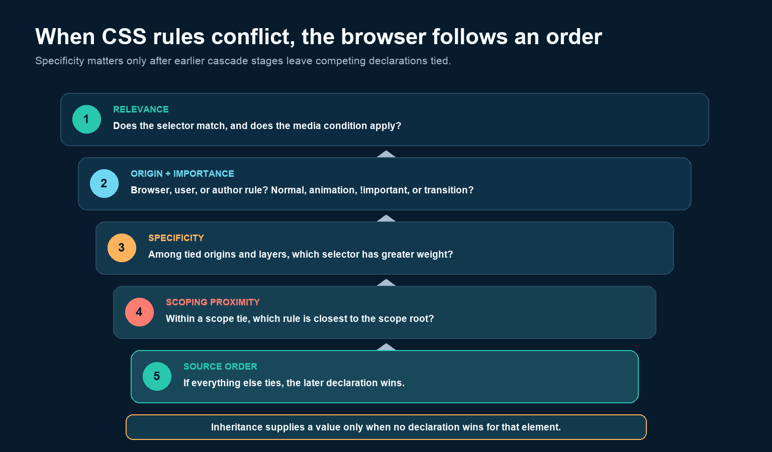
- Relevance: does the selector match, and is any media condition true?
- Origin and importance: where did the rule come from, which layer contains it, and is it normal, animated, important, or transitioning?
- Specificity: among declarations still tied, which selector has greater weight?
- Scoping proximity: for applicable scoped rules, which is closer to the scope root?
- Order of appearance: if the preceding factors tie, the later declaration wins.
This order follows MDN’s current cascade explanation. Inheritance is related but different: some properties, such as color, can take a parent’s computed value when the element does not receive a winning declaration of its own. Other properties, such as margins, do not inherit by default.
Every visible element participates in boxes
The CSS box model describes content surrounded by padding, a border, and margin. Padding is inside the border; margin is outside it. With the default content-box model, a declared width applies to the content and padding plus border increase the visible total. With box-sizing: border-box, the declared width includes padding and border.
MDN’s box-model guide also distinguishes block and inline behavior. Understanding those defaults prevents a common beginner mistake: trying random widths and margins without first asking what kind of box the element generates and which layout system controls it.
CSS can respond to the user’s environment
Responsive CSS is not a separate language. Flexible sizing, Grid, Flexbox, container queries, and media queries let the same document adapt. A media query conditionally applies rules based on the environment:
.cards {
  display: grid;
  grid-template-columns: 1fr;
}

@media (min-width: 48rem) {
  .cards {
    grid-template-columns: repeat(3, 1fr);
  }
}
Here the narrow layout uses one column and wider viewports use three. MDN calls media queries a key component of responsive design and notes that they can also react to media type, orientation, resolution, and user preferences. Good CSS adapts without changing the document’s meaning.
CSS is modular, not one frozen “version”
You may hear “CSS3,” but modern CSS evolves as separate modules—Color, Grid, Selectors, Cascade, Fonts, and many others—at different maturity levels. There is no single future CSS4 release that replaces everything at once. Check the specific feature’s specification and browser-compatibility data instead of relying on a broad version label.
This modular model also explains why an old property and a newly standardized selector can coexist. Browsers ignore unsupported declarations while preserving supported parts of the stylesheet, enabling progressive enhancement when it is designed carefully.
What to learn after the first rule
Learn in an order that builds a mental model: basic selectors and declarations; units and colors; the box model; normal flow; Flexbox and Grid; responsive sizing and media queries; the cascade, inheritance, and specificity; then states, transitions, and more specialized modules. Use browser DevTools to inspect which rules match, which declarations are crossed out, and the computed box dimensions.
You do not need to memorize hundreds of properties. You need to read a rule, identify the controlling layout, trace the winning declaration, test the page at different sizes, and consult a reliable reference. CSS is the system that turns structured content into a responsive presentation; the cascade is the conflict resolver that keeps that system deterministic.