
A practical Excel chart workflow covering clean source data, chart selection, insertion, series repair, dynamic updates, accessibility and final quality checks.

A chart can look polished and still answer the wrong question. A sales table may need a line to show change, bars to compare regions, or a scatter plot to test a relationship. If you let the first visual suggestion decide the story, formatting can hide a structural mistake.
To create a chart in Excel, arrange your data as a rectangular table with headers, select the relevant range, then choose Insert > Recommended Charts. Preview a chart, select it, and choose OK. Use Chart Design to change the data range, switch rows and columns, add titles or labels, and change the chart type. Choose the chart by the question you need it to answer—not by decoration.
The six-step chart workflow
- State the question. Decide whether the reader should compare categories, see change over time, inspect a relationship, understand a distribution, or see composition.
- Prepare one coherent source range. Put field names in a header row, categories or dates in one column, and numeric series in adjacent columns. Remove unrelated notes and decide whether totals belong.
- Select the intended data. Include the headers that should become series names and the category column that should label the horizontal axis.
- Insert and preview. Choose Insert > Recommended Charts, inspect the preview, and open All Charts if the suggestions do not match your question.
- Repair the interpretation. If categories and series are reversed or data is missing, use Chart Design > Select Data and Switch Row/Column.
- Edit for the reader. Add a specific title, units, necessary labels and alt text; remove clutter; check the scale; then test what happens when the source data changes.
On Windows, Alt + F1 can immediately create a chart from the selected data using Excel’s default chart type. It is useful for a quick diagnostic, not proof that the type is appropriate. Recommended Charts is slower by only a few seconds and gives you a preview before insertion.
Prepare the data before you select a chart
Excel can analyze a continuous range when you select one cell inside it, but deliberate selection is safer when the worksheet contains nearby totals, notes, targets or helper calculations. Build a rectangle with one observation per row and one variable per column. Use unique, descriptive headers rather than blank cells or merged title blocks inside the range.
A reliable time-series layout looks like this:
| Month | Actual | Target |
|---|---|---|
| Jan | 82 | 90 |
| Feb | 88 | 90 |
| Mar | 94 | 92 |
| Apr | 91 | 94 |
| May | 101 | 96 |
| Jun | 108 | 98 |
Do not include a grand-total row in a monthly trend unless the total is genuinely another comparable period. A total is derived from the months; plotting it as a seventh month creates a false jump. Likewise, do not mix percentages and currency in the same value axis. If two units must appear together, consider separate charts first and a carefully labeled combination chart only when direct comparison is essential.
Choose the chart by the question

| Reader question | Good starting type | Why it works | Common misuse |
|---|---|---|---|
| Which category is larger? | Clustered bar or column | Length supports direct magnitude comparison | Too many categories or decorative 3-D perspective |
| How did the value change over ordered time? | Line | Continuity makes direction and turning points visible | Connecting categories that have no meaningful order |
| Do two numeric variables move together? | Scatter | Both axes are quantitative | Using a line chart, which spaces category labels evenly |
| How are observations distributed? | Histogram or box-and-whisker | Shows shape, spread, quartiles or outliers | Replacing the distribution with only an average |
| How does each segment contribute to a total? | Stacked bar/column; limited pie or doughnut | Represents part-to-whole composition | Many slices, similar values, negative values or totals that are not a whole |
| How do actual and target differ over time? | Two-line chart or restrained combo chart | Keeps both series aligned to the same periods | A second axis that makes unrelated scales look correlated |
Excel’s recommendation is a starting point based on the selected data; it does not know the decision the audience must make. Preview the suggestion, then ask whether the visual encoding matches the question. If not, choose All Charts or change the type after insertion.
Create the chart in desktop Excel
- Click and drag across the range, including the header row. For the example above, select all three columns and the six month rows.
- Open the Insert tab and choose Recommended Charts.
- Click each suggestion to preview it. Choose All Charts when you want a specific family such as Scatter, Histogram or Combo.
- Select the chart and choose OK. Excel inserts it as an object on the worksheet.
- Move or resize the chart without covering source cells you still need to inspect. Select the chart to expose the Chart Design and Format tabs.
Excel for Mac and Excel for the web follow the same core sequence—select data, open Insert, choose a chart, and format it—but the ribbon labels, side panes and available options can differ by version and subscription. Use the instruction for your current interface rather than assuming a Windows screenshot is pixel-for-pixel identical.
Worked example: actual versus target
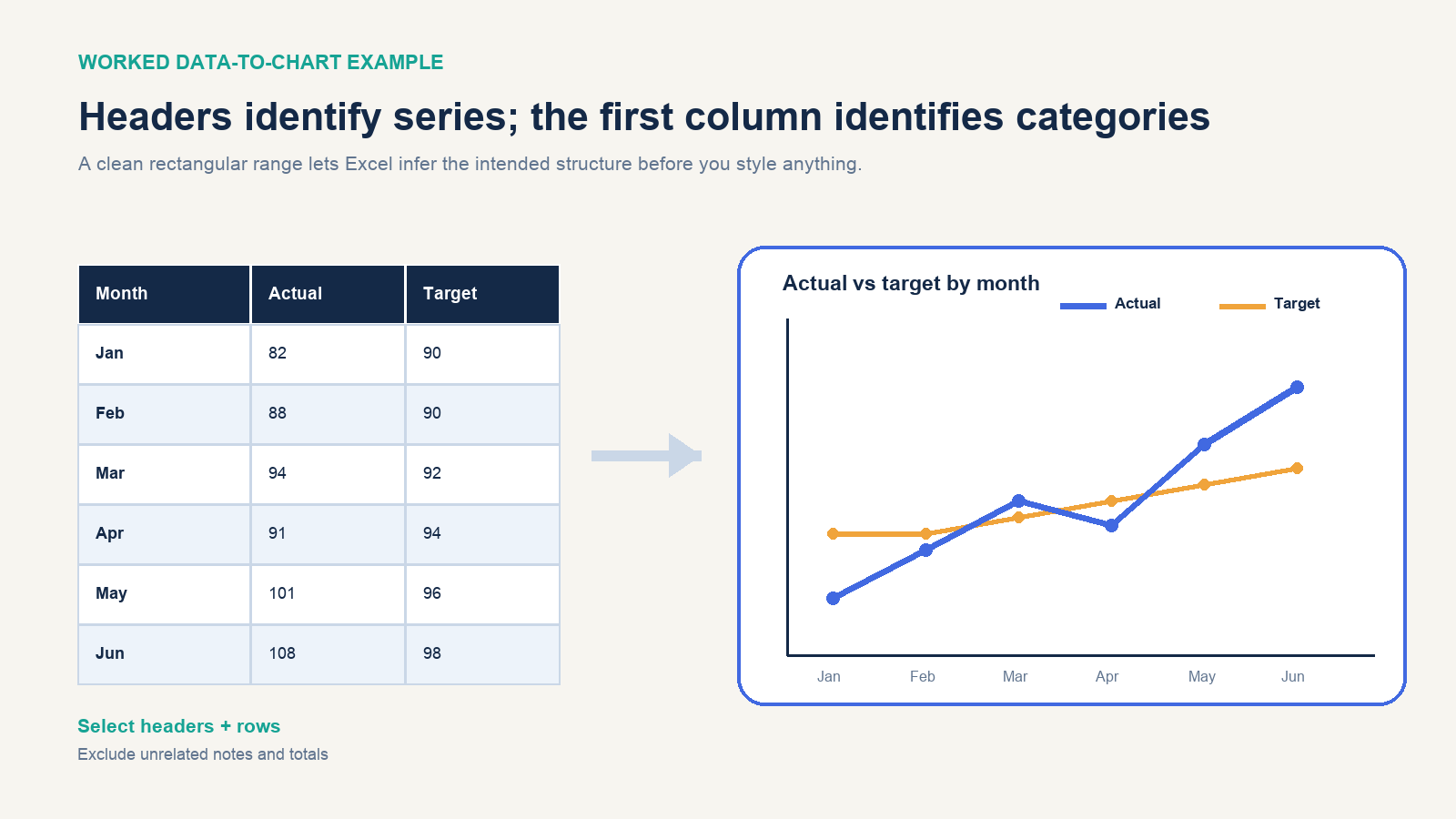
Select Month, Actual and Target for January through June, then insert a 2-D line chart. The chart should contain six horizontal-axis categories and two series. A useful title is Actual vs Target by Month; “Sales Chart” would force the reader to infer both the comparison and time grain.
The visual should show actual moving from 82 to 108 and crossing above target in March, falling below it in April, then finishing above it in May and June. That sentence is also a quality test: if you cannot verify the statement from the chart without studying the source table, the chart needs clearer labeling, a different scale, or a different type.
If the units are thousands of dollars, say so in the vertical-axis title or number format. Do not rely on workbook context that disappears when the chart is pasted into a slide or exported as an image.
If Excel plots the data the wrong way
Select the chart and open Chart Design > Select Data. Check the chart data range, the list of legend entries (series), and the horizontal category labels. A series name should normally reference the header cell, while its values should reference only the numeric cells below that header.
Use Switch Row/Column when Excel has made each month a series and Actual/Target the categories. The command changes how worksheet rows and columns are plotted; it does not repair a fragmented or semantically inconsistent table. If switching merely produces a different wrong chart, return to the source range and restructure it.
To add or remove a series, use Select Data rather than painting over the chart. To exclude a few points temporarily, use the chart filters where available. To change the visual family without rebuilding, select the chart and choose Chart Design > Change Chart Type. Most 2-D charts also allow a single series to use a different type, creating a combination chart.
Edit the chart for a reader
- Write a message-bearing title. Name the subject, comparison and time period when they matter.
- Label units. Distinguish dollars from thousands of dollars, counts from rates, and percentages from percentage-point change.
- Use data labels selectively. Labels help with a small number of important values; labeling every point on a dense line chart creates noise.
- Keep a legend only when needed. Direct labels at the ends of a few lines can be easier to follow, but ensure the labels remain linked to the correct series.
- Inspect the axis scale. Truncated bar-chart axes can exaggerate differences because length is the encoding. A line chart may use a nonzero baseline when justified, but the scale must remain explicit.
- Avoid 3-D decoration. Perspective distorts apparent length and area without adding a third measured variable.
- Remove low-value clutter. Lighten or remove redundant gridlines, borders and backgrounds; keep the elements that support reading.
Use Chart Design > Add Chart Element to add or remove chart titles, axis titles, data labels, legends, gridlines and trendlines. A trendline is a model or summary of a series, not extra observed data. Choose its form for a reason and do not use extrapolation settings as a guarantee about future values.
Make the chart update when rows are added
A chart based on a fixed range such as A1:C7 does not necessarily include a new row entered at A8:C8. One practical pattern is to convert the source range to an Excel Table: select one cell in the range, press Ctrl + T on Windows, confirm that the range has headers, and build the chart from the table columns. Tables are designed to expand as adjacent rows are added, allowing dependent charts to follow the growing source.
Microsoft also describes dynamic charts built with Excel Tables, dynamic arrays or PivotTables in current Excel releases. These approaches serve different workflows. A Table is a good default for row-based records; a dynamic array is useful when formulas generate the displayed range; a PivotChart is suited to interactive aggregation and filtering. Test the exact workbook by adding, deleting and filtering a row before relying on automatic updates.
Make the chart accessible
Use a descriptive title, axis titles and data labels where they add meaning. Do not encode the only distinction between series with red and green; combine color with markers, line styles, direct labels or other cues. Use adequate contrast and legible type sizes, especially if the chart will be reduced in a slide or report.
Add alt text by selecting the chart and opening Format > Alt Text or Edit Alt Text, depending on version. Describe the insight and purpose, not merely “line chart.” For the worked example, useful alt text would mention that actual crosses above target in March, slips below in April, and finishes above target in May and June. Keep the underlying data table available when readers may need exact values.
Before sharing, run Review > Check Accessibility. The checker can flag issues such as missing alt text or insufficient contrast, but it cannot decide whether the selected chart type tells the truth about the data. Human review remains necessary.
Troubleshooting common chart problems
| Symptom | Likely cause | Repair |
|---|---|---|
| Blank or nearly blank chart | Values are stored as text, range is wrong, or filters hide data | Verify cell types and the Select Data range; inspect filters |
| One series per row | Rows and columns were interpreted in the wrong orientation | Use Switch Row/Column, then confirm series names and categories |
| New rows do not appear | The chart references a fixed range | Expand the range or use a tested Table, dynamic array or PivotChart source |
| Dates are evenly spaced despite irregular intervals | A line chart is treating dates as categories or dates are stored as text | Confirm real date values and axis type; consider an XY scatter chart for numeric time spacing |
| One giant final point | A total row was included as another category | Exclude the total unless it is intentionally part of the comparison |
| Series look correlated but units differ | A secondary axis or scale choice creates a visual illusion | Use separate charts or label and justify both scales explicitly |
| Labels overlap | Too many categories or excessive data labels | Filter, aggregate, rotate only when necessary, or switch to horizontal bars |
Finish with one concrete test: give the chart—without the source sheet—to someone who knows the subject but not the workbook. Ask what comparison they see, what the units are, and what conclusion is justified. If the answers differ from your intent, revise the data selection or chart type before spending more time on colors and effects.