
A screen-first answer to a commonly mistyped blue-mixing question, with exact RGB values, palette decisions, CSS examples, and measured contrast pairs.

On a screen, no two colours are needed to make pure blue: blue is one of the RGB channels. In an sRGB color picker, set red to 0, green to 0, and blue to 255. The result is rgb(0 0 255), hexadecimal #0000FF, or the CSS named color blue.
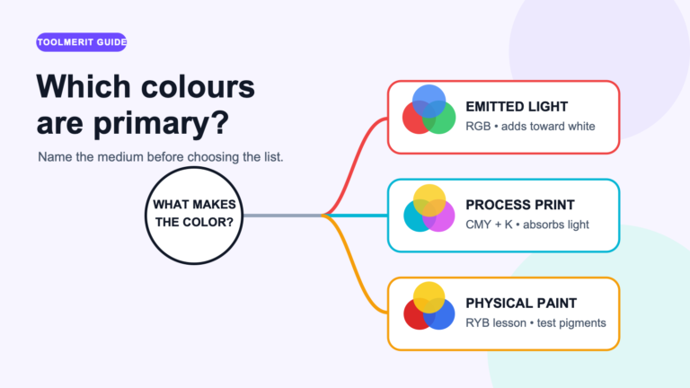
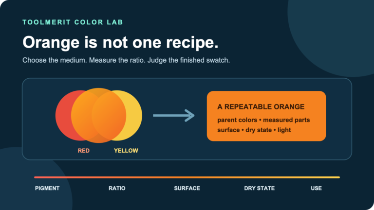
The search phrase “what to colours make blue” is usually a typo for “what two colours make blue.” The right answer changes with the medium. This guide answers the color-picker version: light emitted by a display. It does not reuse the subtractive pigment recipe that applies to paints, inks, or dyes.
First choose the medium: screen, paint, or print
A recipe is meaningful only inside a color model. A monitor uses red, green, and blue components to specify displayed color. The W3C CSS Color specification describes sRGB colors as a triplet of red, green, and blue values. A browser can express that triplet with RGB numbers, hex notation, HSL, HWB, a named color, or newer color functions.
| If you are working with | Working model | What “make blue” means |
|---|---|---|
| Website, app, slide, digital image | Usually RGB or sRGB | Choose a blue coordinate; pure blue already has its own channel |
| Artist paint | Subtractive pigment mixture | Start with a blue pigment or a pigment system that can mix toward blue |
| Commercial printing | Usually device/profile-dependent CMYK | Specify a printable color and soft-proof it for the actual press profile |
That distinction prevents the most common wrong answer. Red and green light do not make blue; in additive RGB they combine toward yellow. A paint instruction such as mixing cyan and magenta also cannot be copied blindly into a screen picker. The objects may look related, but the physical process and coordinate system are different.
Pure screen blue is a channel setting
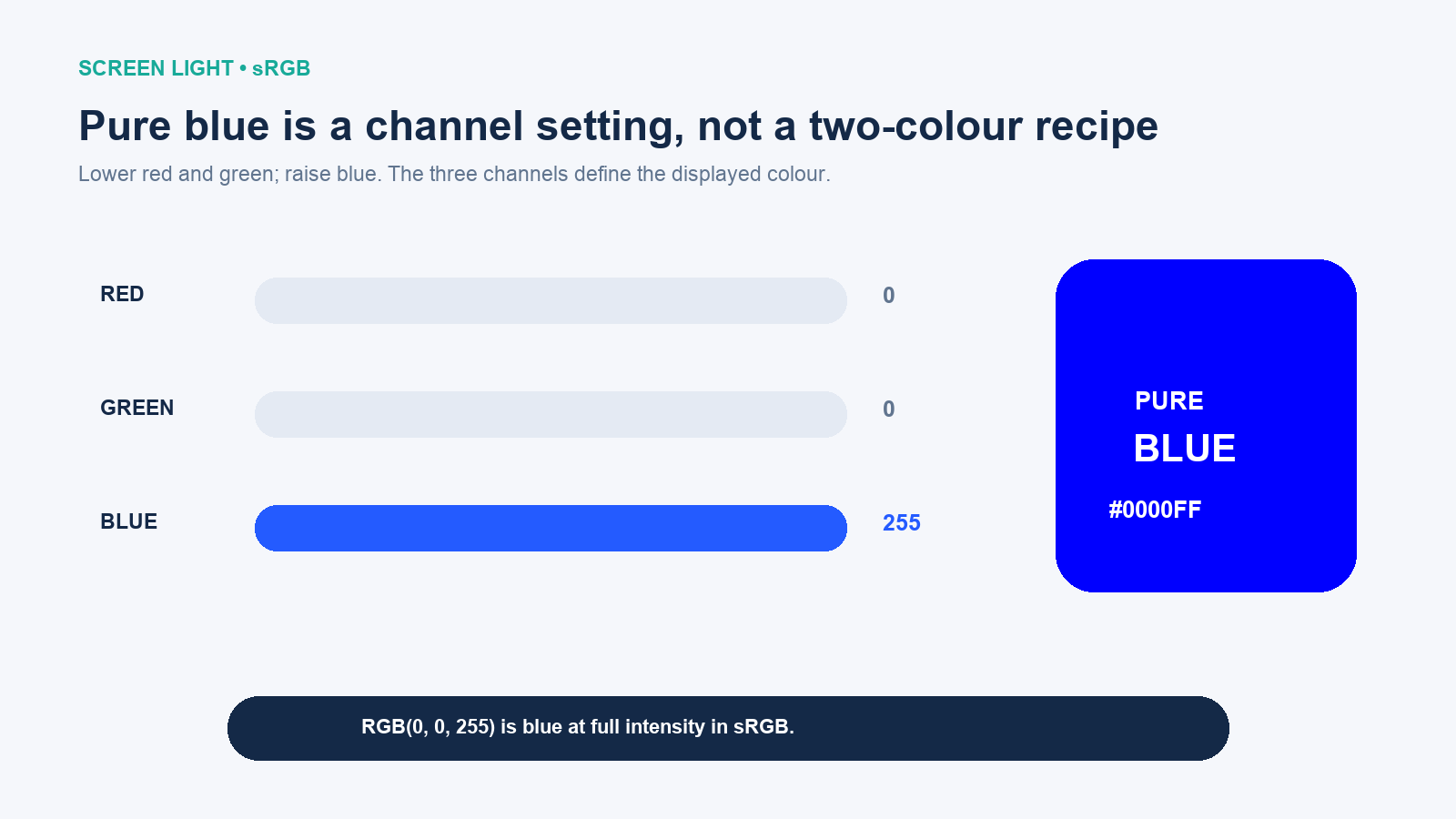
In the common 8-bit RGB interface, each channel runs from 0 to 255. Zero means no contribution from that channel; 255 is the maximum encoded value. Pure blue therefore sits at R 0, G 0, B 255. In CSS percentages, the same point is rgb(0% 0% 100%).
“Pure” here means the defined sRGB coordinate, not a promise that every display will look identical. Panel technology, calibration, brightness, ambient light, color-management support, and viewing angle can all affect appearance. The code remains the same even when the viewing conditions do not.
Enter blue in the format your picker accepts
Most general-purpose pickers expose one or more of these notations. They are different descriptions of the same canonical sRGB blue:
| Format | Value for pure blue | How to read it |
|---|---|---|
| RGB, 0–255 | rgb(0 0 255) |
No red, no green, full blue |
| Hexadecimal | #0000FF |
00 red, 00 green, FF blue |
| HSL | hsl(240 100% 50%) |
Blue hue, full saturation, middle lightness |
| HWB | hwb(240 0% 0%) |
Blue hue with no added whiteness or blackness |
| CSS keyword | blue |
Defined by CSS as #0000FF |
- Confirm that the picker is using RGB/sRGB rather than CMYK, Lab, or a proprietary slider.
- Enter
#0000FFwhen you need the canonical reference blue. - Keep opacity or alpha at 100% if you want that exact displayed value over the current background.
- Save the code, not only a screenshot of the swatch, so the color remains reproducible.
Browser-native <input type="color"> controls accept CSS color values. MDN documents limited sRGB as the default color space and also documents newer alpha and Display-P3 options. Because the visible picker can differ by browser and operating system, treat the stored value as the source of truth.
If you insist on two colours, start with blue
There is no honest pair of non-blue RGB primaries that suddenly produces the pure blue channel. If a digital mixer asks for two inputs, at least one input must already contain blue for the midpoint to retain a blue component. The result is then a blue variation, not the origin of blue.
- Blue + white makes a lighter tint, useful for surfaces and quiet backgrounds.
- Blue + black makes a darker shade, useful for dense navigation or dark-mode surfaces.
- Blue + cyan pushes the result toward sky, azure, or electric blue.
- Blue + magenta pushes the result toward indigo or violet.
- Blue + transparent changes opacity; the visible result also depends on the background underneath.
Do not assume that a 50/50 mix will look perceptually halfway between its endpoints. The interpolation color space matters. W3C’s color-mix() definition requires a mixing space and defines how percentages are normalized; current CSS Color Level 5 uses Oklab when a space is omitted. For reproducible design work, state the space explicitly.
Create lighter and darker blues without guessing
Begin with one approved anchor, then derive variations. For a website, #1D4ED8 is a more practical action blue than pure #0000FF: it remains strongly blue, but its slightly moderated channel values are easier to fit into a coherent interface.
:root {
  --blue-action: #1D4ED8;
  --blue-action-light: color-mix(in oklch, #1D4ED8 72%, white);
  --blue-action-dark: color-mix(in oklch, #1D4ED8 82%, black);
}
Provide fixed fallback values before a newer function when your browser support policy requires it. Then test the computed color, because mixing percentages are not accessibility guarantees. A design-token name should describe the role—action, surface, or link—rather than only saying “blue 3.” Role names survive palette changes more gracefully.
A worked blue palette for a website
The following set is deliberately small. It separates interactive blue, readable link blue, decorative accent blue, pale surface blue, and dark blue text. The contrast figures are calculated from the WCAG relative-luminance formula; they are not judgments made by eye.
| Token | Color | Recommended role | Important pairing |
|---|---|---|---|
| Action | #1D4ED8 |
Primary button background | White text: 6.70:1 |
| Link | #0057D9 |
Body-text link on white | White page: 6.24:1 |
| Accent | #3B82F6 |
Large icon, chart accent, or decoration | White text: 3.68:1; not ordinary AA text |
| Surface | #DBEAFE |
Info panel or selected-row background | #172554 text: 12.04:1 |
| Ink | #172554 |
Dark text on pale-blue surface | White page: 14.69:1 |
These roles are examples, not a universal brand palette. Validate them in the component where they will actually appear, including hover, focus, active, disabled, error, and dark-mode states. A link also needs a non-color cue where color alone would otherwise carry meaning.
A blue swatch is not automatically accessible
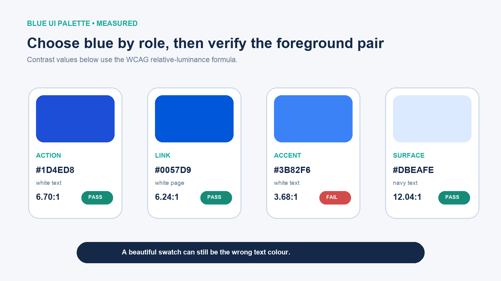
WCAG 2.2 requires a contrast ratio of at least 4.5:1 for ordinary text and 3:1 for qualifying large text. Necessary visual information that identifies user-interface components or states generally needs 3:1 against adjacent colors. Those are threshold values: 2.99:1 does not round up to a pass.
This is why #3B82F6 can be a useful accent yet fail as a white-backed button for ordinary white text. The same swatch may work with dark text, as a large graphic, or as decoration. Change either the role or the foreground pair instead of declaring the color “accessible.”
Why the same blue may look different
- Color space: sRGB and Display-P3 can encode different gamuts. A number without its color-space context is incomplete.
- Opacity: a semi-transparent blue is composited with whatever is behind it.
- Surrounding color: identical pixels can appear lighter, darker, warmer, or cooler beside different neighbors.
- Display and environment: calibration, brightness, panel type, ambient illumination, and viewing angle affect appearance.
- Export path: screenshots, image optimization, missing profiles, and app conversions can change the rendered result.
Keep the source color values in design tokens, preserve profiles in exported assets when the workflow calls for them, and review on representative devices. Eyedropping a screenshot is a last resort because it samples a rendered result rather than the original specification.
The decision rule
If your target is a screen, do not search for two non-blue colors to manufacture blue. Start with the RGB blue channel—#0000FF for the canonical reference or a tested product blue for real interface work. Mix that anchor with white, black, cyan, or magenta only when you want a deliberate variation, state the interpolation space, and validate the final foreground-background pair for its actual role.