
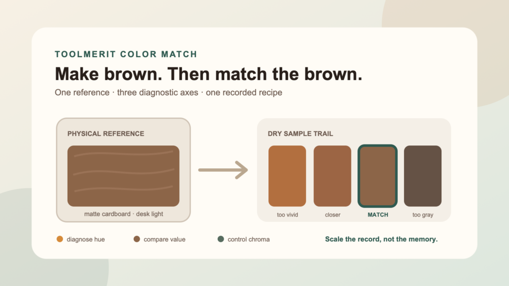
Start with a small brown mixture, isolate the exact mismatch, and build a dry sample recipe that resembles the reference you actually need.
You mix red, yellow, and blue and get a brown—but it looks nothing like the cardboard, wood, leather, or photograph you are trying to match. The mixture is not necessarily wrong. “Brown” names a family, while your project needs one member of that family.
To make brown paint, first mix red and yellow into an orange base, then add blue in much smaller increments until the orange becomes a muted brown. If you need a particular brown, do not keep correcting one large pile: compare a dry swatch with the reference, identify whether the main error is hue, value, or chroma, divide a reserved sample into small portions, and change only one variable in each portion. Record the closest dry result before scaling it.
This guide is for matching a declared physical reference with acrylic, tempera, gouache, or another opaque water-based paint. The method also works conceptually with oil paint, but drying time and handling differ. It is not a universal drop recipe, a factory color-control specification, or a promise that three primary paints can reproduce every commercial coating.
Define the brown before touching the paint
“Make brown” is too open to verify. “Match the unprinted side of this cardboard under the desk lamp, on matte illustration board” is a workable target. Fix the target before mixing so the reference does not change halfway through the process.
| Target-brief field | What to decide | Why it changes the match |
|---|---|---|
| Reference | One physical object, card, chip, or approved sample | Two “brown” objects may differ in warmth, darkness, and intensity. |
| Paint and substrate | The exact paint set and the surface that will receive it | Opacity, absorption, texture, and the color underneath affect appearance. |
| Finish | Matte, satin, or gloss | Reflections can make the same colored layer appear lighter, darker, or more saturated. |
| Viewing light | The light in which the finished object matters most | Different light sources distribute wavelengths differently. |
| Acceptance level | Close visual resemblance, prop-camera match, or controlled production match | A craft repair and a branded production run require different evidence. |
If you do not have a specific target and simply want a pleasant brown, start with ToolMerit’s broader guide to choose among three dependable brown-mixing routes. This page owns the narrower job of moving one mixture toward one reference. When that reference is part of a poster, package, or interface project, the design and graphics tools hub covers the surrounding digital work.
Make a small starting brown
Use a clean palette and reserve most of each parent color. A reliable starting sequence is warm first, neutralizer second:
- Combine yellow with a smaller amount of red to make an orange base.
- Mix until no red or yellow streaks remain.
- Move a small portion of the orange into a separate working area.
- Add blue with a toothpick tip, palette-knife corner, or another unit smaller than the units used for the orange.
- Mix fully before deciding whether to add more.
Why not specify equal parts? Paint labels describe colors, not equal mixing strength. The Golden Artist Colors mixing guide explains that masstone, undertone, opacity, transparency, and tinting strength all affect a mixture. Its guide identifies phthalo colors as especially strong relative to some yellows. One full blue drop can therefore overpower several drops of a weaker orange mixture.
Orange and blue are a convenient route because many familiar browns sit in a muted yellow-red or orange region. Red plus green and yellow plus violet can also make brown families, but they start with different biases. Use the route whose parents are closest to the target and whose paints you can measure consistently.
Make only enough base for several samples. Leave a visible portion untouched and write down the starting inputs. If the first result becomes blackish, gray, or green, do not add all three primaries again. Restore it with fresh orange base or start a smaller trial with a weaker dose of blue.
Prepare a fair side-by-side comparison
A paint pile on a white palette and a brown object on a colored table are not being viewed in the same context. Surrounding color, paint thickness, gloss, and lighting can exaggerate the difference. Compare a painted swatch and the reference through two openings in one neutral gray card. The card hides most surrounding colors and forces both samples into adjacent, similarly sized fields.
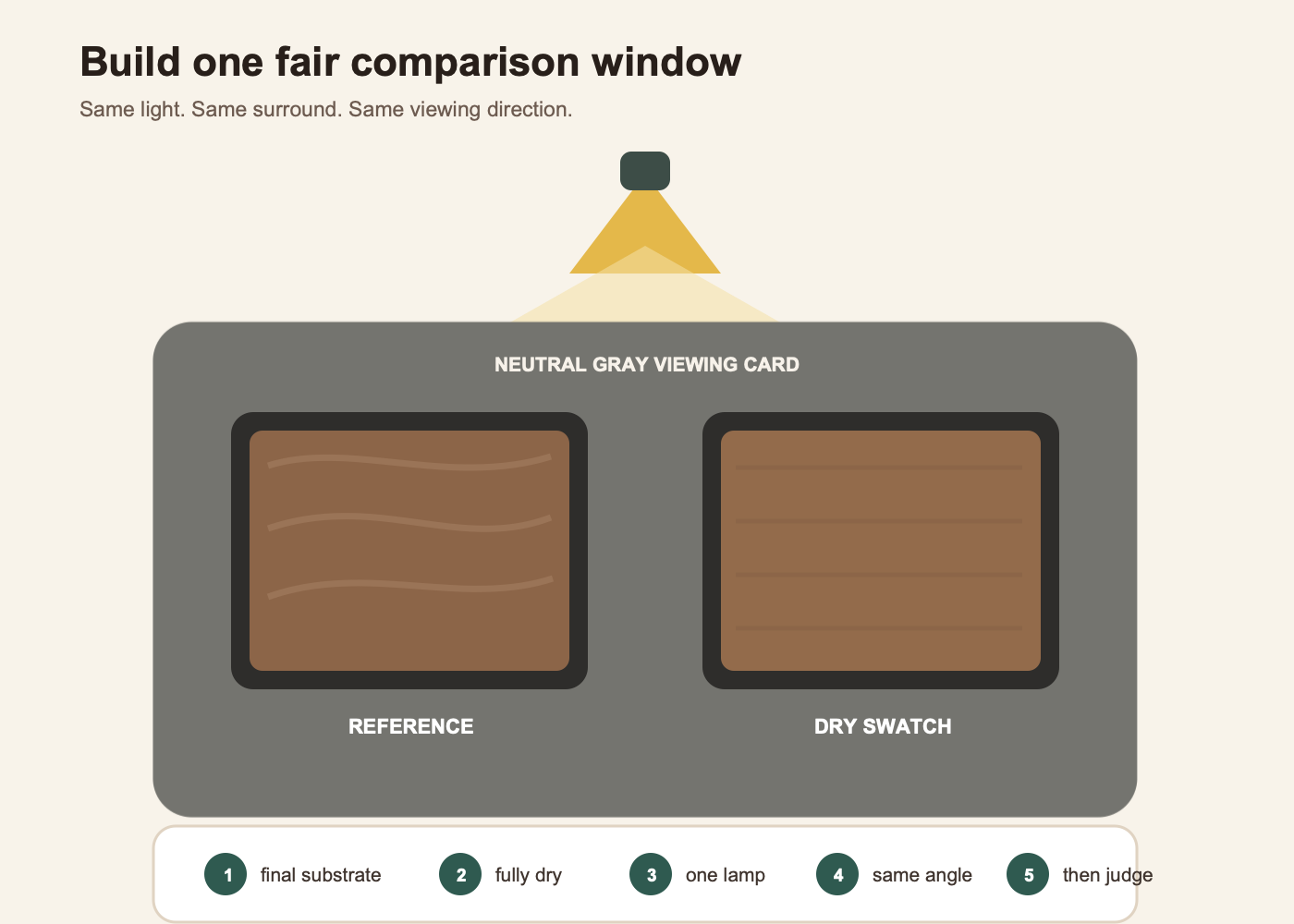
- Paint each trial on the final substrate or on a sample of the same material and primer.
- Apply approximately the same thickness and tool marks that the finished project will use.
- Let the swatch reach its comparison state—normally fully dry for acrylic or tempera.
- Place the reference and sample in the same light and viewing direction.
- Look through the gray comparison card, first at normal distance and then closer.
A photo or screen can be a useful memory aid but is a weak physical color standard. Camera exposure, white balance, editing, compression, display calibration, and room light all intervene. If the target comes from a faded family print, decide whether you are matching the present paper or reconstructing an earlier appearance; ToolMerit’s preservation-first old-photo workflow keeps restoration decisions separate from color evidence.
If the final output is a web page rather than paint, stop mixing pigments and use a defined digital value. The guide to how CSS applies a specified screen color explains that branch. A hex value does not predict a paint recipe, and a photograph of paint does not define one universal screen value.
Diagnose the largest mismatch on three axes
Color becomes easier to correct when you stop calling a sample merely “wrong.” The Munsell color sphere describes colors through three dimensions: hue, value, and chroma. Gamblin’s painter-facing guide similarly defines hue as the color family, value as lightness or darkness, and chroma as intensity or distance from gray. Use those dimensions as a diagnosis, not as a requirement to own a Munsell book.
| Axis | Question to ask | Typical brown mismatch | First controlled direction |
|---|---|---|---|
| Hue | Which color family is pulling the sample away? | Too red, orange, yellow, green, or violet | Use a tiny amount of the opposing family or rebuild with a better-biased base. |
| Value | Is the sample lighter or darker than the reference? | A correct warm brown that is visibly too dark | Test white or a lighter compatible base in a separate portion. |
| Chroma | Is the sample more colorful or more gray than the reference? | An orange-brown that is too vivid, or a dead gray-brown | For too vivid, add a complement or equal-value neutral; for too gray, add fresh colored base. |
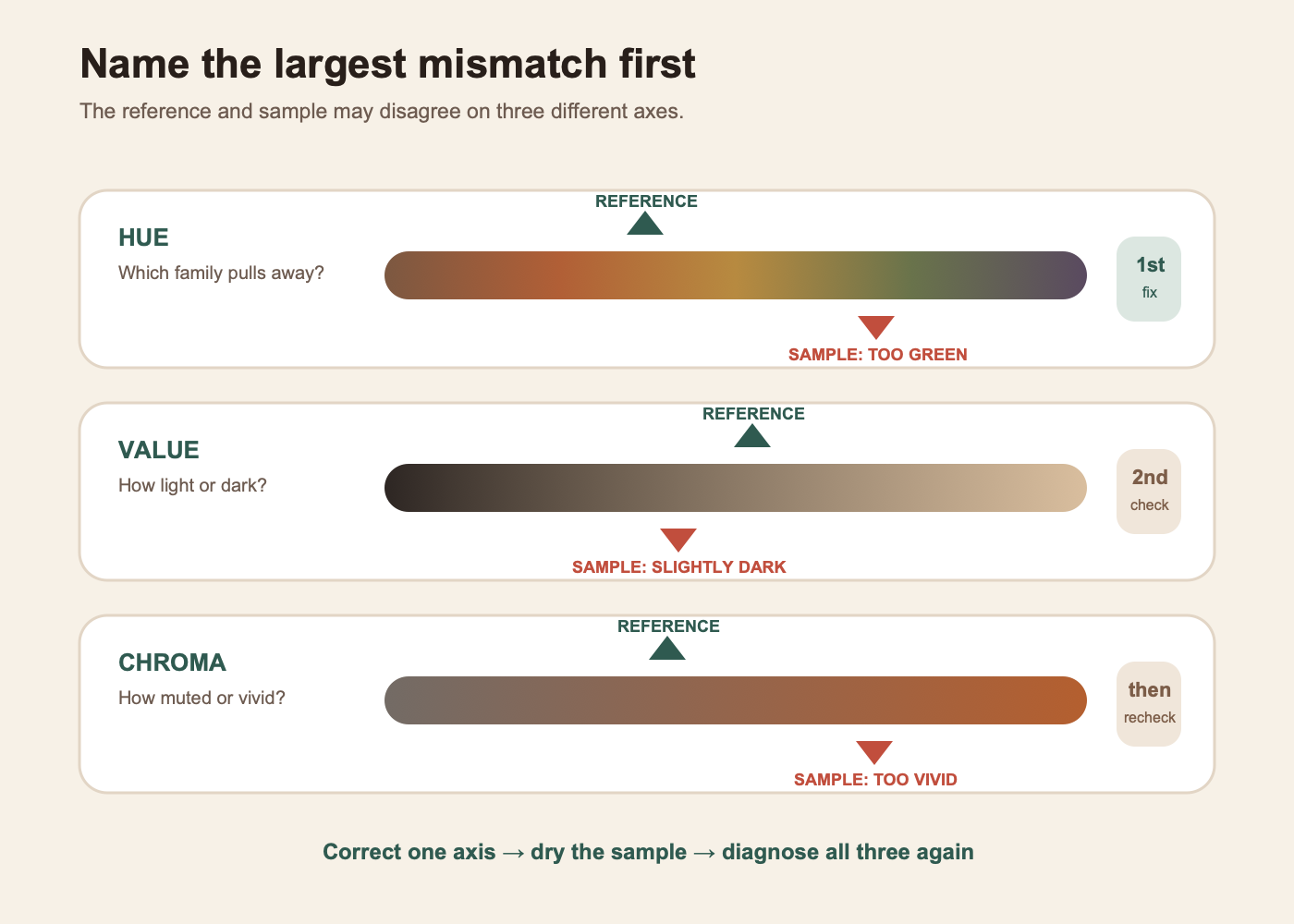
Do not correct all three axes at once. White may raise value but can also cool, opacify, or reduce chroma. A complement may reduce chroma while also lowering value. Black may darken but can shift hue and make the mixture look lifeless. Choose the largest visible error, make one restrained correction, let the sample dry, and diagnose again.
A quick value check can help when hue is distracting: narrow your eyes or view a grayscale phone photo of the reference and swatch together. Treat the photo only as a relative light-dark comparison made in the same frame, not as an absolute color measurement.
When a blue correction is needed, the blue-paint mixing guide helps select a physical paint blue without borrowing an RGB screen recipe.
Run a four-portion correction ladder
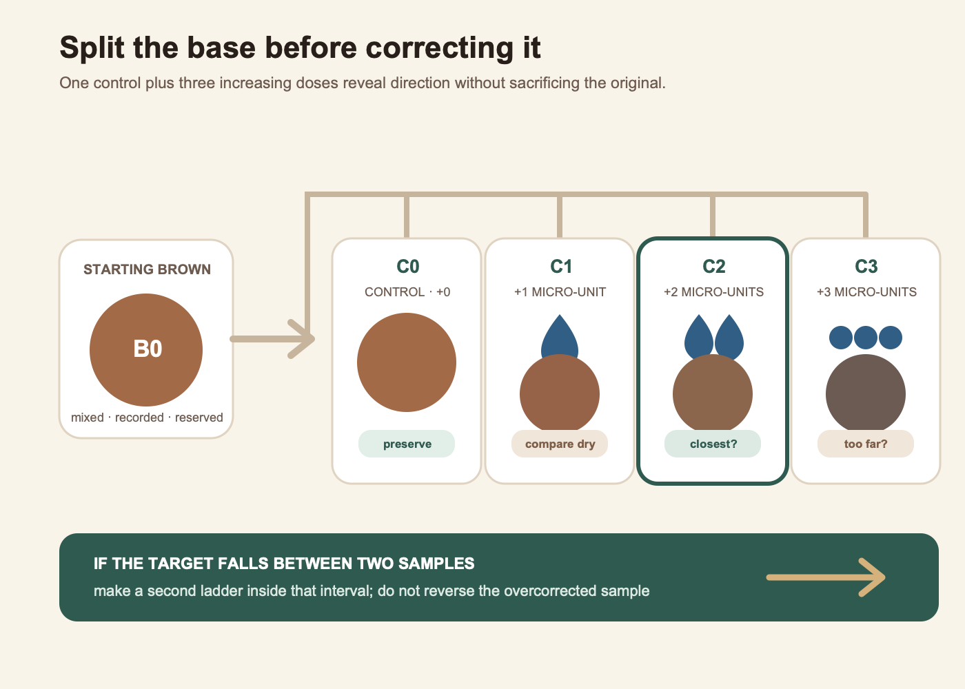
Once you know the first correction direction, do not add it to the entire base. Build a short ladder that preserves the control and tests increasing doses.
- Mix the starting brown thoroughly and label its recipe B0.
- Place four equal measured portions on the palette and label them C0, C1, C2, and C3.
- Leave C0 unchanged. It is the control.
- Add one micro-unit of the chosen correction to C1, two to C2, and three to C3.
- Mix each sample with a separate tool or clean the tool completely between samples.
- Paint labeled swatches on the final substrate, let them dry, and compare them through the neutral card.
- Choose the closest sample. If none brackets the target, change the micro-unit or the correction direction and build a new ladder.
A micro-unit must be repeatable in your setup: one toothpick-tip transfer, one small drop from a fine bottle, or a weighed amount for a larger studio test. “A little” is not a recipe. Record the parent paint names, units, correction, substrate, and dry judgment. For many repeats, you can record repeated trials in Excel; for photographing, labeling, and handing off the sample set, the creative production tools hub covers the surrounding workflow.
The ladder is not always linear in appearance. C2 may look closer than C1 while C3 suddenly goes gray because the correction pigment is strong. That is useful: the target has been bracketed between two preserved samples. Make a second ladder inside that smaller interval rather than trying to reverse C3.
Worked example: match a cardboard reference
The following is an illustrative record, not a tested universal recipe. Its purpose is to show how decisions and assumptions should be written. Your pigments will produce different results.
Target brief: resemble the matte, unprinted side of one cardboard box; use student acrylic on primed illustration board; judge after drying under the desk lamp; accept a close visual prop match rather than a manufacturing tolerance.
| Stage | Illustrative recipe or observation | Decision |
|---|---|---|
| Orange base O0 | 8 units yellow + 4 units red | Reserve half before neutralizing. |
| Starting brown B0 | 4 units O0 + 1 micro-unit blue | Swatch and dry; do not judge only on the palette. |
| Diagnosis | Assume B0 dries at roughly the right value but appears more orange and more vivid than the cardboard. | Blue is the first correction because it can reduce the orange bias and chroma; value will be checked again afterward. |
| Ladder | Four equal B0 portions; add 0, 1, 2, and 3 smaller blue transfers. | Keep C0 as evidence and compare all four dry. |
| Illustrative selection | Assume C2 is closest, while C3 is too cool and gray. | Rebuild C2 from the written ratio; do not enlarge the damaged C3. |
| Value refinement | If rebuilt C2 is slightly dark, divide it and test two tiny white additions against an unchanged control. | Recheck hue and chroma because white can change both appearance and coverage. |
The important result is not the numbers themselves. It is the chain of evidence: the orange parent was saved, the blue correction was smaller than the base units, the control remained visible, the largest mismatch determined the correction, and the selected formula was rebuilt rather than estimated from a nearly empty sample.
Accept the match only in its real setting
A palette match is provisional. Winsor & Newton’s acrylic color-shift guide notes that many acrylics darken as the binder changes while drying, although the amount depends on the formulation. X-Rite’s color-evaluation guidance also explains that two materials may match under one light and separate under another—a phenomenon called metamerism. A craft project does not need a laboratory, but it does need a declared viewing condition.
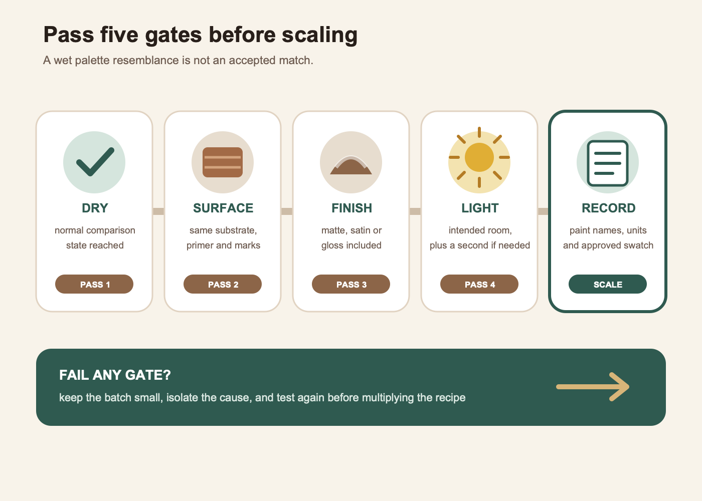
Use this stop rule:
- Dry: the sample has reached the paint maker’s normal comparison state.
- Same surface: substrate, primer, application thickness, and tool marks represent the finished object.
- Same finish: any matte, satin, gloss, or protective layer is included in the judgment.
- Intended light: the match works in the environment that matters; a second light is checked if the object will move between locations.
- Recorded: the recipe, paint names, units, and accepted swatch are preserved.
When the brown belongs to a logo, package, or repeatable identity, store the approved references with appropriate brand asset tools. A physical paint sample and a digital specification should be related but separately approved. After defining the digital branch, prepare a scalable vector master for logos and graphics rather than treating a phone photograph of the swatch as the master asset.
Know when the palette cannot reach the target
Three primaries can create a wide range of browns, but not every paint set can reproduce every reference. The target may require a lighter value than the mixture can reach without too much white, a cleaner orange bias than the available red and yellow allow, a particular opacity, or a surface effect created by metallic particles, translucency, stain, or layered glazing.
Stop adding pigments when every correction solves one axis but damages another. At that point, change the starting material: use a tube earth color nearer the target, add a more suitable warm or cool primary, prepare a colored ground, or accept a documented close match. For an exact commercial coating, textile, print, or multi-vendor brand match, move to a color-managed production process with declared tolerances and appropriate measurement; a hobby palette and a browser photo are not sufficient evidence.
The practical decision rule is simple: if you need any brown, make an orange base and neutralize it gradually with blue. If you need that brown, define the reference, diagnose hue, value, and chroma, correct the largest error in split samples, and approve only the dry result in its real setting. Scale the record—not the memory of the color.