
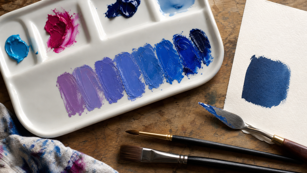
A pigment-specific answer to making blue, with palette selection, controlled cyan-magenta tests, adjustment rules, failure repairs, and material cautions.
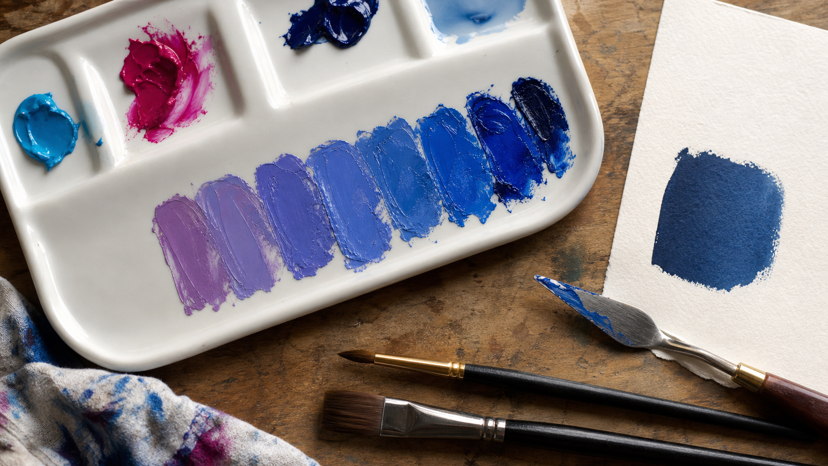
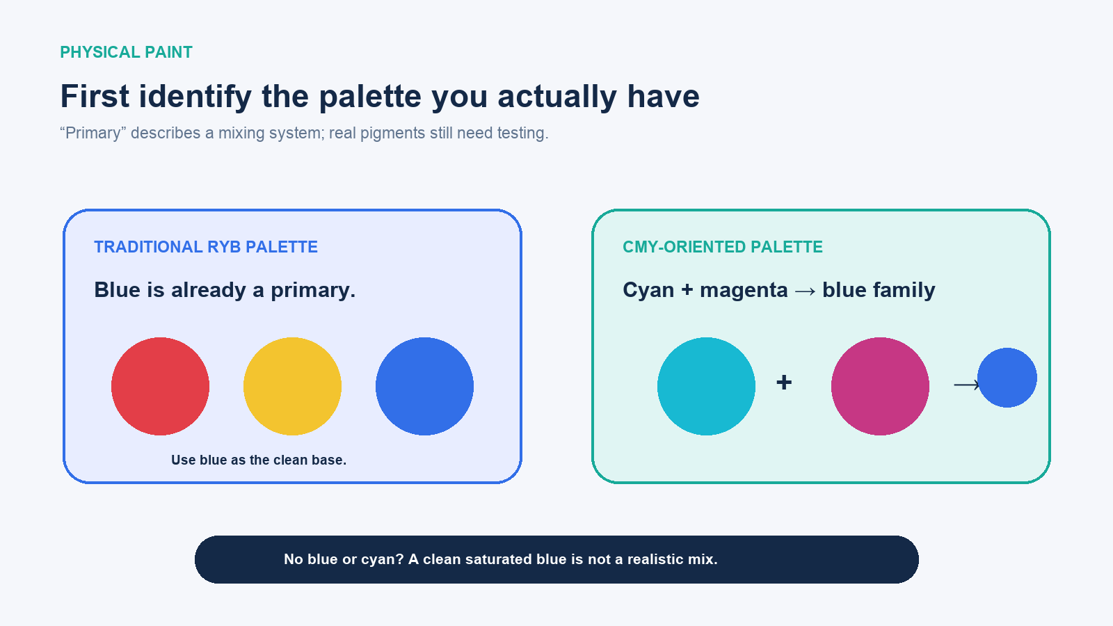
For physical paint, cyan plus magenta can make a blue-family colour: start with mostly cyan and add magenta in very small amounts until the mixture loses its green bias and reaches the blue you want. In a traditional red-yellow-blue art palette, blue is treated as a primary colour, so the cleanest saturated blue normally comes from blue paint rather than from mixing red and yellow or other ordinary colours.
Both statements can be true because “primary colour” belongs to a chosen mixing system, not to one universal recipe. This guide is specifically about artist paints and other physical pigments. Mixing coloured light on a screen and combining printer inks use different controls and should not be copied directly onto a paint palette.
The answer depends on which paint palette you have
| Materials available | Best route to blue | Expected limit |
|---|---|---|
| A tube or pan of blue paint | Use it as the base; adjust temperature and value | The pigment’s own hue and mixing strength define the starting blue |
| Cyan and magenta | Begin with cyan; add magenta gradually | Can enter blue and blue-violet, but real pigments are not ideal primaries |
| Traditional red, yellow, and no blue | Buy or borrow blue/cyan rather than mixing all colours | Red plus yellow produces orange; adding more pigments usually neutralises the mix |
| Green and purple | Use only for a deliberately muted approximation | Both paints may contain pigments that absorb too much light, creating grey or brown |
| White plus black | Not a route to blue | Produces neutral grey unless one paint already has a blue bias |
The Hong Kong Observatory’s colour-science explanation distinguishes red-green-blue light primaries from the cyan-magenta-yellow pigments used for subtractive mixing. Pantone makes a similar medium distinction: traditional art teaching often names red, yellow, and blue, while physical print, paint, and dye workflows can be described with cyan, magenta, and yellow.
Why cyan and magenta can move toward blue
Paint is seen through the light it reflects. A cyan colourant removes much of the red portion of incoming white light, while a magenta colourant removes much of the green. Layering or mixing them leaves more of the shorter blue-region light available to reach the eye. This is called subtractive mixing because each added colourant absorbs additional parts of the illumination.
The ideal diagram says cyan + magenta = blue, but a real tube contains a specific pigment, binder, fillers, and sometimes multiple pigments. Opacity, concentration, undertone, particle behaviour, and lighting alter the result. Golden Artist Colors cautions that manufactured pigments are not perfect primaries and recommends practical mixing tests rather than expecting a colour wheel to predict every blend.
A controlled way to mix blue from cyan and magenta
- Check the labels or swatches. Select the cleanest cyan-like and magenta-like colours available. A single-pigment paint often gives a more interpretable test than an already mixed convenience colour.
- Work on a clean white palette. Residual yellow, orange, or black can neutralise the mixture quickly.
- Place a generous cyan sample. Reserve an untouched swatch so you can compare the shift.
- Add a pin-tip of magenta. Mix completely, then paint a small labelled swatch on the same paper or surface used for the artwork.
- Repeat as a ladder. Add another tiny, consistent amount of magenta to the remaining mix and make the next swatch.
- Let samples dry. Acrylic, gouache, and watercolour can change value or saturation as water evaporates; judge the final state.
- Record the workable ratio. Use parts or weighed amounts for a larger batch, but treat the ratio as specific to those exact products.
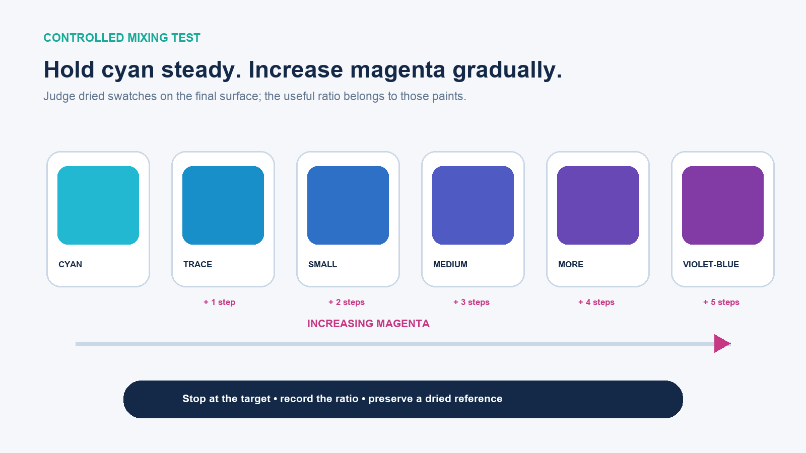
A useful first test is five piles with the same amount of cyan and increasing magenta. Do not interpret “mostly cyan” as a guaranteed numeric formula. A strong quinacridone magenta may shift the mixture much faster than a weak classroom paint. The procedure—the controlled additions and dried comparison—is transferable even when the ratio is not.
Choose a target blue before adjusting the mixture
| Target | Adjustment from a cyan-magenta blue | What to watch |
|---|---|---|
| Green-leaning blue | Use less magenta or return a little cyan | Too much cyan becomes turquoise rather than blue |
| Balanced middle blue | Make micro-additions of magenta until the green cast disappears | The perceptual midpoint varies with pigment and light |
| Violet-leaning blue | Add a little more magenta | Crossing the target can produce purple |
| Pale sky blue | First establish the hue, then add it into white | White raises value and often reduces apparent chroma |
| Dark navy | Start with a dark blue; adjust carefully with magenta or a neutral dark | Black can flatten the colour and expose an unwanted undertone |
| Muted blue | Add a minute amount of its opposing warm colour or neutral grey | Neutralisers are powerful; make a side pile |
If blue paint is available, it is usually a better base. Ultramarine commonly leans toward violet, while phthalo blue green shade leans toward cyan and has strong tinting power. Product names are not measurements, so compare the manufacturer’s swatch and pigment information and test with the actual medium.
What white, black, red, green, and yellow do to blue
- White makes a tint: lighter in value and usually less intense. Add the blue mixture into white for better control because strong blue may dominate quickly.
- Black lowers value but can also dull the colour or reveal a warm/cool undertone. Build a separate test rather than darkening the whole batch.
- Magenta or cool red pushes blue toward violet. A warm orange-leaning red may neutralise it more than expected.
- Cyan or blue-green moves blue toward turquoise.
- Yellow moves cyan/blue toward green and can rapidly reduce a violet-blue mixture’s chroma.
- Orange or warm brown can mute blue toward a neutral, useful for shadows but not for making a clean blue from scratch.
Golden’s colour-mixing research demonstrates why generic labels are insufficient: different choices of red, yellow, and blue can produce secondary colours with dramatically different chroma, and real inorganic and organic pigments do not behave identically.
Why a mixture turns muddy instead of blue
| Symptom | Likely cause | Repair |
|---|---|---|
| Grey or brown result | Yellow/orange contamination or multi-pigment colours absorbing too broad a range | Clean tools and restart with simpler cyan and magenta paints |
| Purple instead of blue | Too much magenta | Move a small portion aside and add cyan; do not risk the master pile |
| Turquoise instead of blue | Too little magenta | Add magenta in pin-tip increments |
| Chalky pale blue | Too much opaque white | Prepare a stronger hue first, then tint a fresh white pile |
| Wet match dries differently | Medium-specific colour shift, absorption, or sheen | Evaluate dried swatches on the final support |
| Large batch cannot be repeated | Unrecorded eyeballed additions | Use measured parts or mass and retain a drawdown sample |
Paint safety and permanence still matter
Use artist materials according to their labels and safety data. Do not assume artist paint, craft paint, cosmetics, food colouring, and coatings are interchangeable. Ventilation, skin contact, cleanup, disposal, and suitability for children or food-contact surfaces depend on the actual product.
For work that must last, check lightfastness and compatibility as well as wet colour. A visually successful mix can fade or separate if one component is unsuitable for the binder, surface, or exposure. Keep the product names, pigment identifiers when available, mixing ratio, medium, support, and dried reference swatch with the project notes.
The practical answer for an artist’s palette
If you have blue paint, begin with the blue closest to your target and modify it. If you have a CMY-style palette but no separate blue, begin with cyan and add magenta gradually, testing dried swatches. If you have neither blue nor cyan, combining unrelated colours is unlikely to create a clean, saturated blue; obtain a suitable blue or cyan instead of consuming paint on an impossible target.
The reliable skill is not memorising “two colours make blue.” It is identifying the medium, choosing a physically plausible route, controlling one variable at a time, and judging the dried mixture against a defined target.