
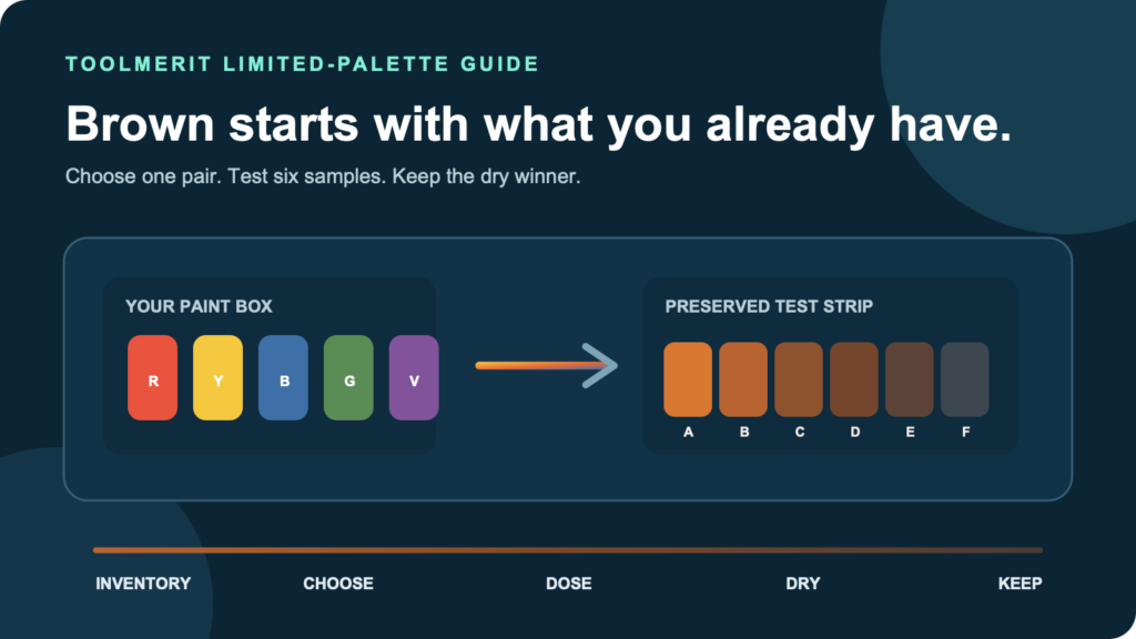
An inventory-first method for turning the paints already on your palette into a useful brown without gambling on one large mixture.
You have red, yellow, blue, perhaps green or violet—and no tube labeled brown. The wasteful move is to squeeze a little of everything into one growing puddle. The useful move is to choose one complementary route, divide it into tiny samples, and preserve the point where the color becomes the brown you need.
Make colour brown by reducing the intensity of a warm colour with its opposite: mix orange with blue, red with green, or yellow with violet. If you only have primary paints, mix red and yellow into orange first, split it into small samples, then add blue to each in increasing amounts until one reaches the brown you need. Keep the successful sample and note the ratio.
That answer is deliberately not an equal-parts formula. Golden Artist Colors explains that complements reduce a color’s intensity, while actual pigments differ in tinting strength. The same physical amount of two paints can have very unequal visual power. This method finds a local recipe for the compatible paints already in your box instead of pretending that every “red,” “yellow,” or “blue” behaves alike.
Choose a brown route from the colors in your paint box
Keep the first test inside one compatible paint system: acrylic with acrylic, watercolor with watercolor, oil with oil, or gouache with gouache. Then inventory the color families you actually have. Choose the first route below that matches the box.
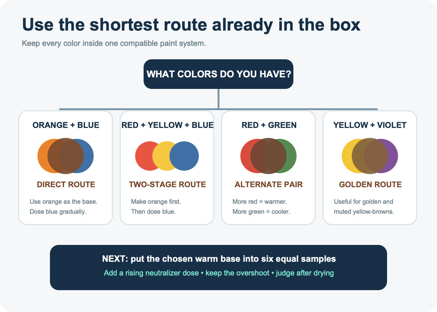
- Orange and blue available: use orange as the base and introduce blue gradually. This route makes the warm-to-cool transition easy to see.
- No orange, but red, yellow, and blue available: mix a clear orange from red and yellow first; do not add all three at once. Then neutralize samples of that orange with blue.
- Red and green available: start from whichever parent is closer to the target. More red usually keeps the result warmer; more green moves it cooler.
- Yellow and violet available: use this route for golden, ochre-like, or muted yellow-brown territory, while expecting the exact result to depend strongly on the paints.
- A brown already exists: adjust that tube color in separate samples rather than remaking a neutral from three parents.
The companion guide to three complementary brown-mixing routes explains the color-wheel logic and broader warm/cool choices. This page has a narrower job: selecting a route from a limited box and finding its stopping point with very little paint.
Inspect the labels when they list pigments. Liquitex notes that combining multi-pigment colors can put many pigments into one mixture, causing it to neutralize faster. That does not make student or convenience colors unusable; it means the brown may appear earlier in the test and the gap between brown and gray may be small. Winsor & Newton also recommends judging color bias in a thin undertone, because the apparent color straight from the tube can hide which way it leans.
Use the primary-color systems guide to keep physical-paint logic separate from RGB and print formulas before choosing the route.
Build a six-well brown test instead of one large pile
The test needs one warm base, one neutralizer, six labeled positions, a repeatable transfer tool, and a white or intended sample surface. A plastic palette, glazed tile, scrap of compatible primed board, or six pieces of paper can work if the material is appropriate for the paint.
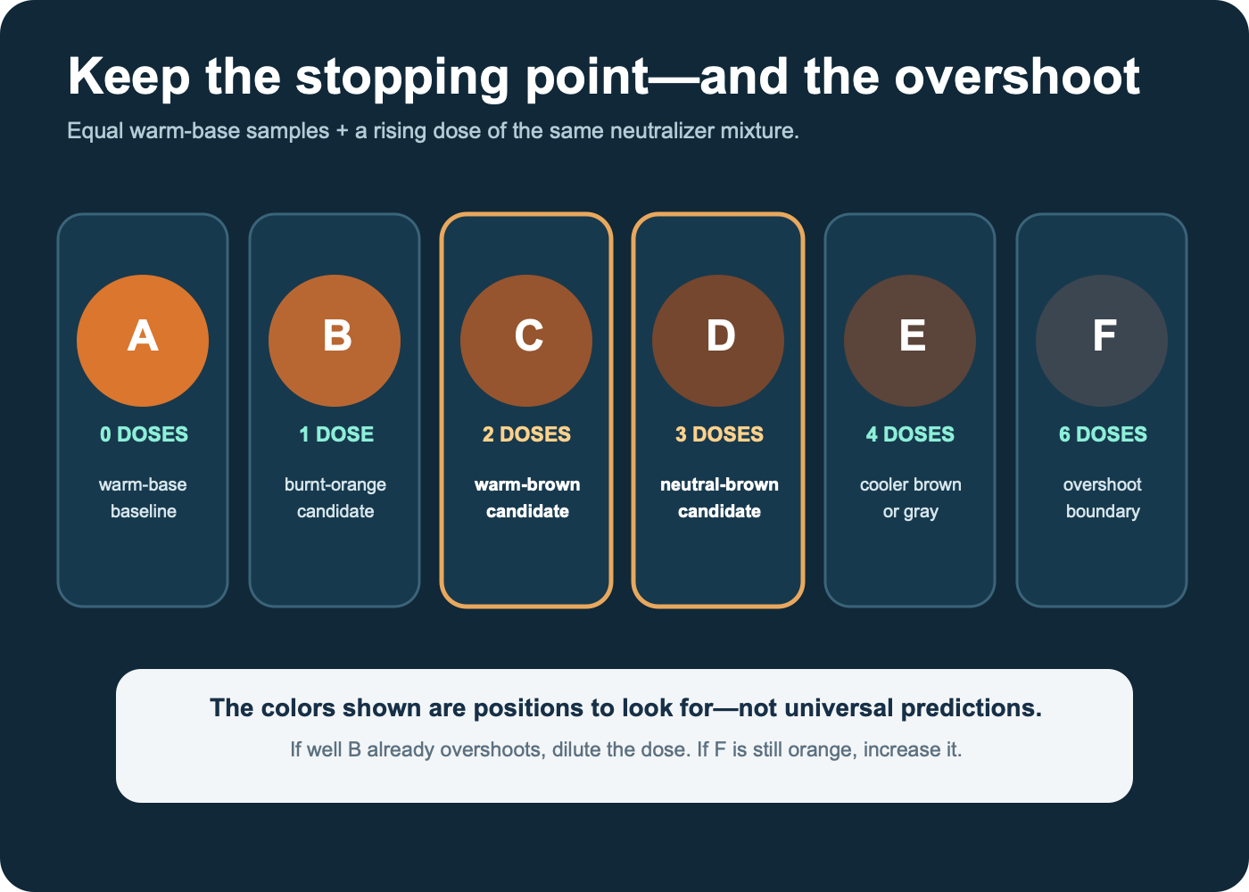
- Make enough warm base for eight or nine small units. Keep its recipe visible.
- Place one equal unit of that base in wells A through F.
- If the neutralizer is powerful, make a gentler dosing mixture by combining one unit of neutralizer with three units of the warm base.
- Leave A unchanged. Add one identical micro-transfer of the dosing mixture to B, two to C, three to D, four to E, and six to F.
- Mix each well with a clean tool. Paint a labeled swatch from each at the same thickness.
- Let the samples reach the relevant dry or settled state before choosing the winner.
A “micro-transfer” can be a measured drop for fluid craft paint, a consistent flat palette-knife corner for thick paint, or a controlled brush load for watercolor. Do not compare different transfer methods in the same ladder. If the first dose already jumps past brown, halve the dose or dilute the dosing mixture and repeat on a new strip.
Worked example: turn one orange base into six brown candidates
Assume a beginner has fluid classroom acrylics in yellow, red, and blue. The goal is a medium warm brown for a cardboard model. This is a worked procedure, not a prediction of the exact color that every brand will produce.
- Mix six equal drops of yellow with three equal drops of red. The resulting 2:1 yellow-to-red orange is the warm base.
- Place one drop-equivalent of that base into each of six labeled wells, leaving three base units in reserve.
- Mix the three reserved orange units with one equal blue unit. This 3:1 orange-to-blue mixture becomes a gentler neutralizer dose.
- Use the same small tool to add 0, 1, 2, 3, 4, and 6 dose transfers to wells A through F.
- Brush each sample onto the same cardboard at the same coverage and label the dose count.
| Well | Dose count | Likely position in the sequence | Decision |
|---|---|---|---|
| A | 0 | Orange baseline | Shows the starting hue |
| B | 1 | Burnt or muted orange | Useful if the target is rust rather than brown |
| C | 2 | Warm-brown candidate | Keep if it matches the target after drying |
| D | 3 | More neutral-brown candidate | Compare directly with C |
| E | 4 | Cooler, grayer brown | May suit a shadow or cool target |
| F | 6 | Overshoot boundary | Shows when blue or gray begins to dominate |
These labels describe the sequence to look for, not guaranteed outcomes. A strong blue may move well B into gray; a weak blue may leave well F orange. If C is closest, create a second strip around C using smaller dose steps. Do not scale a palette-knife “dose” directly into a large batch. First reproduce the winner in one new small verification batch, preferably with drops, volume, or mass that can actually be repeated.
Repair the sample by reading its color bias
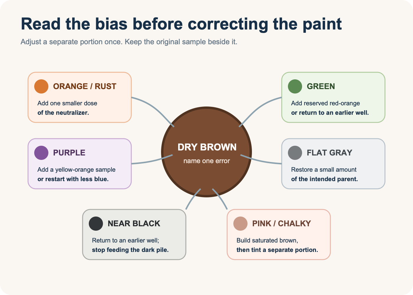
Compare one dry candidate with the target on the same background. Name the dominant error before touching the paint. Correct a separate portion and retain the original sample.
| Result reads as | What probably dominates | One next move |
|---|---|---|
| Orange or rust | Warm base | Add one smaller neutralizer dose |
| Green | Blue plus yellow | Add reserved red-orange base, or restart before the overshoot |
| Purple | Blue plus red | Add a yellow-orange sample, or restart with less blue |
| Flat gray | Near-complete neutralization | Restore a small amount of the desired warm or cool parent |
| Nearly black | Too much dark neutralizer or too many pigments | Return to an earlier well; do not keep feeding the dark pile |
| Pinkish or chalky | White was added before hue was settled | Build a saturated brown separately, then tint a portion |
A biased brown is not automatically a failed brown. Furniture, soil, skin, wood, leather, stone, chocolate, and shadows do not share one neutral center. The correction only makes sense after the target is named.
If blue is the corrective complement, the blue-paint mixing guide helps you choose a usable paint blue rather than importing a screen formula.
Change value without losing the brown you found
Hue direction, intensity, and lightness are separate controls. Set the brown family first. Then divide the accepted sample again to test value changes.
- For tan or a lighter opaque brown: move a sample into white gradually. White creates a tint and may expose a pink, green, or violet bias that was hidden in the dark mixture.
- For a lighter warm brown: test more of the lighter warm parent before reaching for white.
- For a darker chromatic brown: test a little more complement in a separate portion. Winsor & Newton’s shadow guidance recommends a small amount of the opposite color as an alternative to defaulting to black.
- For lower intensity at similar lightness: use a compatible neutral of similar value when available, because black or white changes more than saturation.
Golden’s mixing guide also notes that titanium white changes coverage as well as value. If the target must remain transparent, change dilution or use the compatible transparent medium instead of treating white as a universal lightener.
Adapt the test to acrylic, gouache, oil, or watercolor
The route selector stays useful across paint media, but the sample method must respect the material.
- Acrylic and fluid craft paint: keep drops or measured knife loads consistent and judge after the acrylic clears and dries. Some transparent acrylic mixtures appear lighter while wet because of the milky emulsion.
- Gouache: control water and layer thickness. Compare dry swatches because opacity and value can shift as the layer settles.
- Oil: keep the medium amount and application thickness consistent across the strip; do not compare a lean opaque swatch with a transparent, medium-rich one.
- Watercolor: make equal-strength parent puddles, control water separately from pigment, and paint every candidate on the same paper. Golden’s QoR tests show that dilution, pigment dominance, granulation, separation during drying, and paper can all change the result.
Use clean tools between wells. A contaminated brush silently adds a third or fourth pigment and can collapse several distinct candidates into the same gray-brown.
If the target moves from paint to a digital deliverable, branch to the design and graphics tools collection rather than trying to translate a pigment ratio directly.
Approve one dry sample before making more
A successful sample needs more than the label “brown.” Place it beside the target and record a compact acceptance card:
- paint brand, line, exact color names, and pigment codes when available;
- chosen route and the warm-base recipe;
- neutralizer or dosing-mixture recipe and dose count;
- surface, ground color, application tool, and approximate layer;
- drying or settling interval;
- viewing light;
- whether hue direction, lightness, and intensity match the intended use;
- a physical retained swatch and a pass, revise, or reject decision.
For a one-off school project, writing this beside the swatch is enough. If the brown becomes a recurring brand or product color, move the approved physical reference, photos, usage notes, and digital specifications into a controlled system from the brand asset tools collection.
After one dry sample is approved, use the repeatable brown batch workflow to scale it without losing the recorded ratio.
Know when not to mix a brown
Use a premixed earth or brown when the project needs repeatable large batches, a known pigment and lightfastness profile, a particular transparency or granulation, or fewer variables across multiple sessions. Mixing remains valuable for learning, small variations, local harmony, and using a limited palette; it is not a moral requirement.
If the target is a website, logo, or illustration file rather than physical paint, stop the pigment test. Select and verify a numeric digital color with suitable software from the design and graphics tools collection. Preserve that value in an editable master after learning how vector files store fills and shapes. A screen color and a physical swatch can be coordinated, but one is not a recipe for the other.
The alternative route is therefore simple: use the six-well strip when variation and limited materials are part of the task; use a specified premixed paint when physical repeatability matters; use a color-managed digital specification when there is no paint at all.
For a tiny browser mark, the favicon size-testing workflow is more useful than another paint swatch because contrast and silhouette change at tab size.