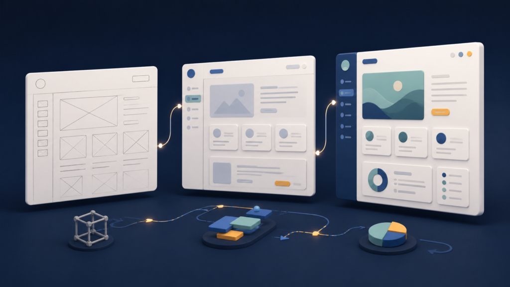
A wireframe is useful when it exposes decisions about purpose, structure, content, behavior, and states—not when it merely makes a page gray.
A wireframe is a simplified blueprint of a website or app screen that shows structure, content hierarchy, navigation, controls, and intended behavior before final visual styling or production code.
It is not simply an ugly version of the finished interface. A useful wireframe makes the team’s assumptions visible while they are still inexpensive to change: what the page is for, what information belongs there, what the user does next, and what happens when the normal path fails. It may be a paper sketch, a set of grayscale screens, or a more detailed clickable model, depending on the question being answered.
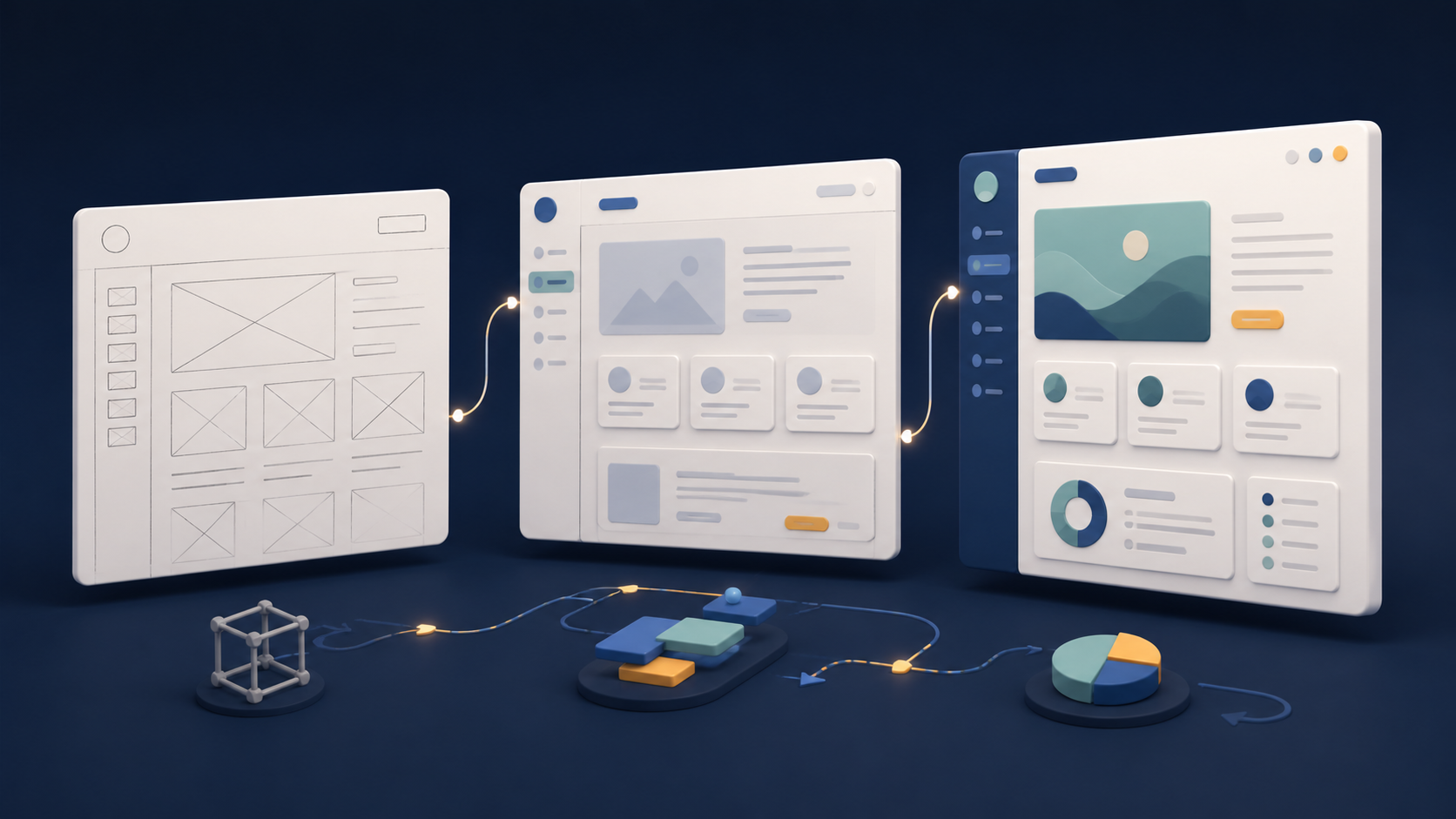
Separate a wireframe from a mockup, prototype, and user flow
Design teams use these words loosely, so identify an artifact by what it can prove rather than what someone calls the file.
| Artifact | Primary question | Usually shows | Does not prove |
|---|---|---|---|
| Wireframe | Are the structure, information, and controls right? | Layout, hierarchy, labels, navigation, actions, states, and annotations | Final visual quality or working software |
| Mockup | Does the visual design communicate the intended brand and hierarchy? | Color, typography, imagery, spacing, icons, and polished components | That interactions or data processing work |
| Prototype | Can someone experience and evaluate an interaction? | Connected screens, transitions, conditional paths, or coded behavior | Production security, performance, reliability, or maintainability |
| User flow | What steps and decisions lead to an outcome? | Nodes, branches, entry points, exits, and alternate routes | The detailed content and hierarchy of each screen |
Figma’s wireframe and mockup comparison draws the central distinction: wireframes focus on basic layout and user flow, while mockups represent the visual design. Its prototyping guide defines a prototype as an interactive, testable model. A set of wireframes can become a prototype when screens are connected, but a static wireframe does not demonstrate that an interaction works.
Read a wireframe as six visible decisions
A page full of gray rectangles is not automatically a wireframe. The artifact becomes useful when another person can inspect the decisions behind those shapes.
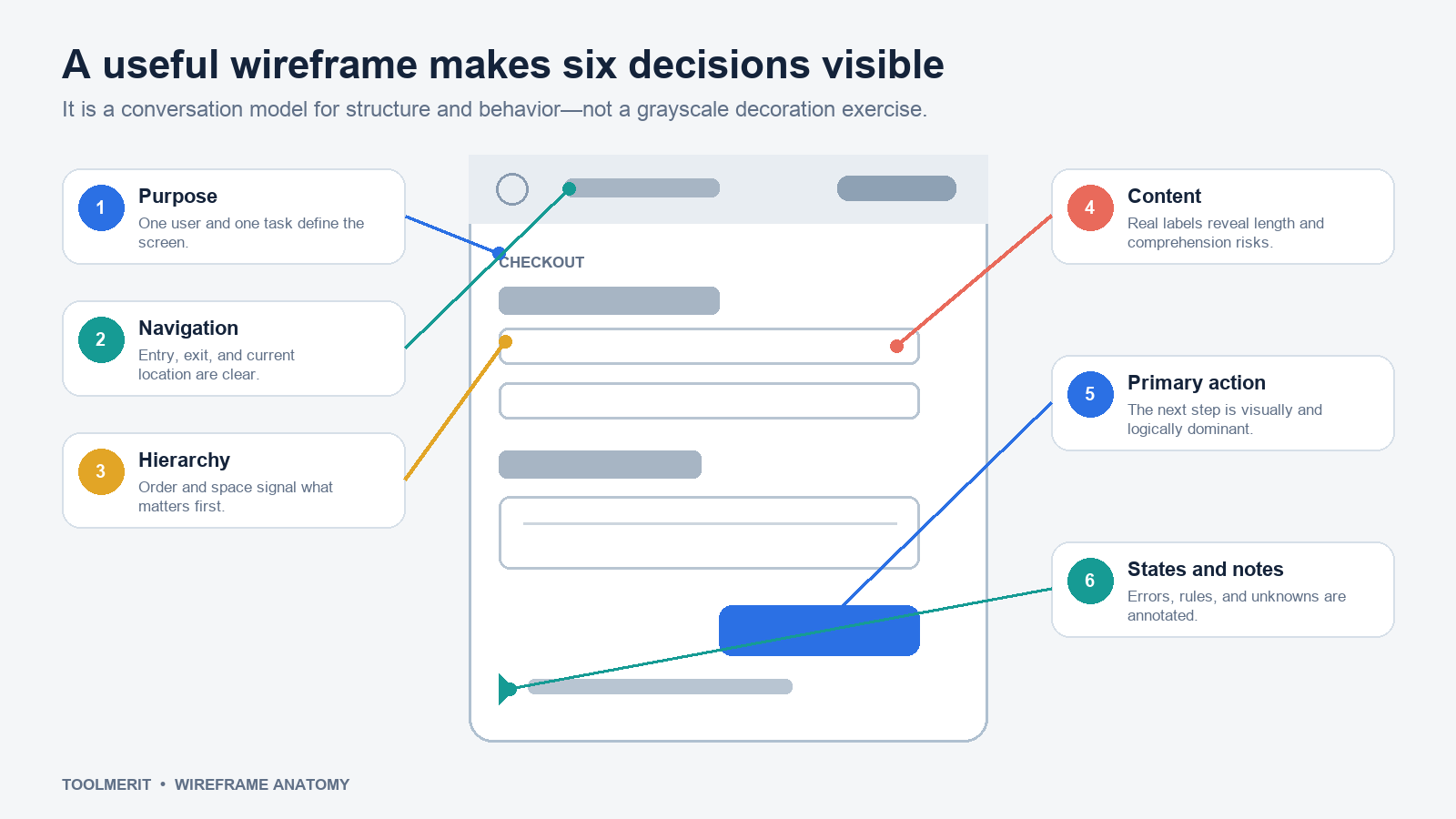
- Purpose: Name the user and the task in one sentence. “Checkout page” is a location; “help a returning buyer confirm an order without re-entering known information” is a purpose.
- Navigation: Show how the person arrived, where they are, what they can go back to, and whether leaving loses work.
- Hierarchy: Use order, grouping, and relative size to show what someone should understand first, not merely where boxes fit.
- Content: Use realistic headings, labels, choices, and messages where wording affects comprehension. Placeholder Latin hides label length and content gaps.
- Primary action: Make the next meaningful step unambiguous. Secondary actions should not visually compete without a reason.
- States and notes: Include validation, empty, loading, permission, success, and recovery behavior that the normal screen cannot show by itself.
Content structure is especially important for websites backed by a content management system. A wireframe that assumes every card has a short title, landscape image, and summary is also making a content-model decision. Test those assumptions with real long titles, missing images, multiple authors, archived items, and restricted content before a component becomes expensive to change.
Build a wireframe from a user task: a checkout example
Suppose a request says, “Design a simple checkout page.” Starting with a header, two columns, and a bright button would produce a layout quickly, but it would leave the hard questions hidden. Turn the request into a working model instead.
1. Write the scenario and completion condition
Use a specific scenario: “A returning customer has one physical item in the cart and wants to pay with a saved card, review shipping details, and receive an order reference.” Completion is not clicking Place order; it is seeing confirmation that the order was accepted and knowing what happens next.
2. List information and decisions before arranging boxes
The buyer needs item and price, delivery address, delivery timing, payment choice, total cost, edit routes, terms, the primary action, and confirmation. The business may need inventory, fraud, tax, and consent behavior. Mark what is known, what is calculated, what the user can change, and what remains an open question.
3. Draw the shortest complete path
Sketch cart review, delivery and payment confirmation, submission, and success. Do not create screens merely because competitors have them. If delivery and payment fit one comprehensible page, use one. If they create an overwhelming or error-prone form, separate them and make progress visible.
4. Add the paths that break the happy path
What happens when the saved card expires, the item goes out of stock, the address is incomplete, the price changes, or submission times out? A wireframe need not solve every implementation detail, but it should identify these states and indicate whether the user stays on the page, loses input, retries, or contacts support.
5. Annotate rules that shapes cannot communicate
A button rectangle cannot explain when it is enabled. A price block cannot explain whether tax is estimated. Add short numbered notes for validation, source data, permissions, responsive behavior, and unresolved questions. Keep product rules separate from visual commentary so developers, content designers, researchers, and reviewers can locate the decision they own.
The result is still visually plain, but it is now reviewable. A teammate can challenge whether the order summary appears too late, whether “Edit” returns safely, and whether an error preserves entered data. Those are more valuable conversations than choosing a corner radius.
Choose fidelity by the next question
Fidelity is the amount of detail and realism in the artifact. It is not a maturity score. A deliberately rough sketch may be the most professional choice when several structures need comparison; a component-based screen may be faster when an established design system has already settled basic styling.
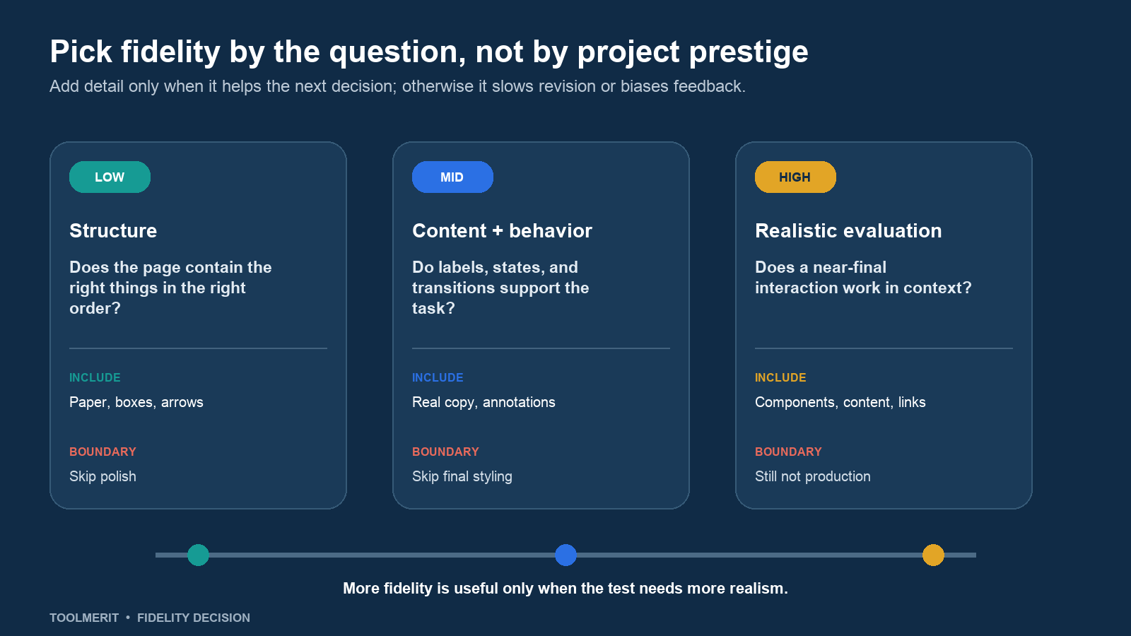
- Low fidelity: Use paper, a whiteboard, or simple boxes to compare page structure, sequence, and rough alternatives. Make several versions quickly enough that discarding one is painless.
- Mid fidelity: Add real labels, representative content, reusable controls, dimensions, states, and annotations when the team needs to evaluate comprehension and behavior.
- High fidelity: Use real components, content, responsive layouts, and connected interactions when evaluation depends on realism. At this point, call it a high-fidelity wireframe, mockup, or prototype according to what it actually contains and does.
Figma’s current wireframing guide describes low-, mid-, and high-fidelity forms and notes that teams with an established design system may sometimes move directly to higher fidelity. The useful rule is not “always start on paper.” It is “do not spend detail that fails to answer the next question.”
Create a first wireframe in 30 focused minutes
The tool can be paper, presentation software, a whiteboard, a design app, or HTML. Tool choice matters less than maintaining a visible decision boundary.
- Minutes 0–5: define the frame. Write the user, task, device or responsive range, entry point, successful outcome, and riskiest assumption.
- Minutes 5–10: inventory content and actions. List what the user must know, provide, choose, change, and receive. Remove anything that does not support the task.
- Minutes 10–20: sketch two structures. Force a meaningful alternative—one page versus steps, list versus comparison, progressive disclosure versus full detail.
- Minutes 20–25: add realistic labels and one failure state. Long labels and errors expose spacing and comprehension problems that placeholders conceal.
- Minutes 25–30: annotate decisions and unknowns. Mark what is required, what is tentative, what data is needed, and what the next review should decide.
Stop when the artifact can support that review. Do not add a logo, illustration, color palette, or component library merely to make the file look finished. If branding or visual hierarchy is itself the research question, state that and intentionally move to a mockup or more realistic prototype.
Review the wireframe without asking whether people like it
“Do you like this?” produces preference, politeness, and debates about missing polish. Use a review script tied to observable decisions:
- State the target user, scenario, and what this version is meant to test.
- Ask a reviewer to point to what they would do first and explain what they expect to happen.
- Ask what information is missing, premature, repeated, or difficult to understand.
- Walk one alternate or error path. Check whether recovery is visible and whether prior work is preserved.
- Separate findings into evidence, decisions, open questions, and visual ideas for later.
When testing with likely users, give them a believable goal without naming the control that completes it. The GOV.UK guidance on moderated usability testing recommends agreeing research questions and observing people attempt relevant tasks. A wireframe can reveal language, layout, and path problems, but a rough static screen cannot validate typing, keyboard order, responsive behavior, performance, or assistive-technology output.
Accessibility is not a final decoration pass. Use the W3C WAI design and development resources to identify structural questions early: heading order, meaningful labels, form instructions, error recovery, alternatives for images, table use, focus sequence, and cognitive load. Then test those requirements again in working code.
Know when a wireframe is the wrong artifact
Skip or shorten wireframing when the structural pattern is already proven, the design system supplies the relevant layout and states, and the uncertainty lies elsewhere. Use a content draft when wording is the risk, a user flow when cross-screen logic is unclear, a data model when relationships are the issue, a mockup when visual trust is the question, or a coded prototype when interaction, accessibility, responsiveness, or technical feasibility must be observed.
The GOV.UK prototyping guidance recommends choosing the kind of prototype that meets the need at the time: sketches suit basic discussion, while code is better for realistic interactions. It also warns that prototype code is not automatically production-quality code. The same boundary applies to wireframes: they are evidence for decisions, not a specification that eliminates design, research, accessibility, engineering, or content work.
In the checkout example, the finished wireframe did not make the page attractive. It made the task, information, choices, failure states, and unanswered rules visible. That is the result to look for. Once the team can explain those decisions and name what needs testing next, the wireframe has done its job.