
A mobile-friendly site preserves the same content and tasks while its layout, controls, media, forms, and performance adapt to a narrow viewport.
Make a website mobile friendly by using one responsive URL and HTML structure, a correct viewport meta tag, flexible CSS layouts, responsive media, readable text, roomy controls, and performance budgets. Preserve the same primary content and tasks at narrow widths. Test reflow at 320 CSS pixels, touch and keyboard operation, portrait and landscape, forms, and real phones. Then use field Core Web Vitals—not a screenshot—as supporting evidence.
The common mistake is shrinking a desktop page until it fits. That produces miniature type, crowded targets, hidden navigation, or horizontal scrolling. A mobile layout must recompose the task, not merely scale the pixels.

Repair in dependency order
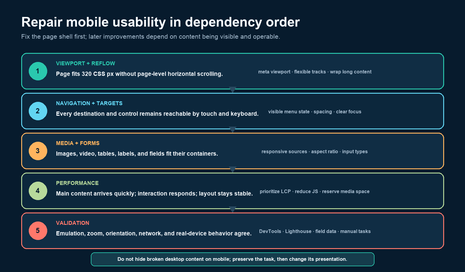
Start with the highest-level failure. If the viewport is wrong or a fixed-width container pushes the page sideways, polishing buttons will not make the page usable. Once content reflows, repair the navigation and controls that expose the tasks. Then fit media and forms, remove performance bottlenecks, and validate the complete journeys.
Google’s current mobile-first indexing guidance describes responsive design as serving the same HTML at the same URL while CSS changes the display by screen size. That approach avoids maintaining a separate mobile page and makes content parity easier. Whatever architecture you use, keep meaningful primary content, metadata, structured data, images, and functionality available to mobile users.
Start with a responsive page shell
Put the viewport declaration in the document head. Do not disable zoom with user-scalable=no or a restrictive maximum scale.
<meta name="viewport" content="width=device-width, initial-scale=1">Then establish a small CSS baseline:
*, *::before, *::after { box-sizing: border-box; }

html { overflow-wrap: break-word; }

body {
  margin: 0;
  font: 1rem/1.5 system-ui, sans-serif;
}

img, video, svg {
  display: block;
  max-inline-size: 100%;
  block-size: auto;
}

.page {
  inline-size: min(100% - 2rem, 72rem);
  margin-inline: auto;
}

.grid {
  display: grid;
  grid-template-columns: repeat(auto-fit, minmax(min(100%, 18rem), 1fr));
  gap: 1rem;
}

button, input, select, textarea {
  font: inherit;
  min-block-size: 2.75rem;
}
This foundation is fluid before any breakpoint. Use media queries when the content—not a favorite device width—actually needs a different arrangement. The current web.dev media-query guide explains how viewport features condition CSS; it does not require a stylesheet for every device.
Make layout reflow instead of overflow
Remove fixed content widths such as width: 1200px. Prefer percentages, grid fractions, flex wrapping, min(), max(), clamp(), and max-width constraints. Inspect the element causing document.documentElement.scrollWidth to exceed the viewport; do not hide the symptom with overflow-x: hidden.
At a width equivalent to 320 CSS pixels, ordinary horizontal-language content should remain available without two-dimensional scrolling. W3C’s Reflow guidance allows exceptions for content whose meaning requires a two-dimensional layout, but the page around that component should still reflow. Put a genuinely wide table or code sample in its own labeled horizontal-scroll region instead of forcing the whole page sideways.
Test long URLs, unbroken identifiers, translated navigation labels, 200% text resize, and 400% browser zoom. A layout that works only with short English placeholder copy is not robust.
Preserve navigation and enlarge the interaction zone
Mobile navigation should expose the same essential destinations as desktop. If it collapses, use a real button with an accessible name and synchronized aria-expanded state. Make the menu operable by touch and keyboard, return focus sensibly when it closes, and ensure sticky headers or cookie banners do not cover the focused control.
WCAG 2.2’s Target Size Minimum requires pointer targets of at least 24 × 24 CSS pixels or one of its documented exceptions. A practical interface may choose a more generous target, such as the 44-pixel control height in the baseline, especially for primary actions. The visible icon can remain small while padding enlarges the clickable area.
Do not make drag the only way to operate a carousel, reorder list, or slider when a simple pointer alternative can perform the same function. Preserve visible focus, labels, error messages, and sufficient contrast.
Repair components without deleting the task
| Component | Typical mobile failure | Repair |
|---|---|---|
| Cards | Fixed columns become too narrow | Use wrapping grid tracks and let cards stack when their content requires it. |
| Images | Oversized files or cropped subject | Use intrinsic dimensions, srcset, sizes, and art direction only when composition changes. |
| Tables | Whole page scrolls sideways | Provide a contained scroller, useful headers, or an alternate stacked presentation. |
| Forms | Labels disappear; keyboard is wrong | Keep visible labels, choose appropriate input types and autocomplete tokens, and place errors next to fields. |
| Embedded media | Iframe or video retains desktop width | Constrain it to the container and preserve its aspect ratio. |
| Sticky UI | Header, chat, or banner covers content | Reduce or unfix it at narrow heights; make overlays dismissible and focus-safe. |
| Long strings | URLs or IDs break the layout | Use human-readable link text and overflow-wrap: anywhere where appropriate. |
For responsive images, the browser can choose among candidates in srcset using the layout hint in sizes. The official responsive images guide shows why this reduces unnecessary image bytes compared with sending one desktop-sized file to every phone.
Make mobile loading and interaction credible
Core Web Vitals currently use three field metrics: Largest Contentful Paint for loading, Interaction to Next Paint for responsiveness, and Cumulative Layout Shift for stability. The “good” thresholds are LCP at or below 2.5 seconds, INP at or below 200 milliseconds, and CLS at or below 0.1, assessed at the 75th percentile of visits.
- Slow LCP: identify the actual LCP element. Compress and size its resource, remove discovery delay, reduce server response time, and do not lazy-load the LCP image.
- Slow INP: break up long main-thread tasks, reduce unnecessary JavaScript and third-party work, and provide immediate visual feedback.
- High CLS: give images and video intrinsic width and height or an aspect ratio, reserve space for embeds and banners, and avoid inserting content above what the user is reading.
A lab score is diagnostic, not proof of every user’s experience. Compare mobile field data by page type, template, country, and connection where possible. Fix the shared template that causes the widest failure rather than chasing one synthetic run.
Validate tasks, not screenshots
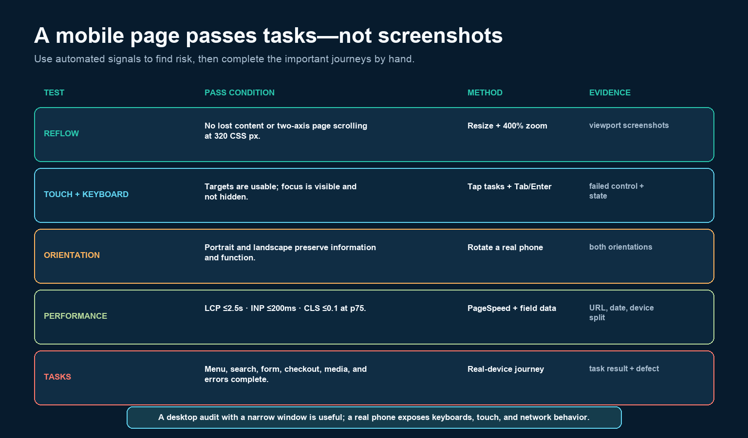
Use browser device emulation to resize quickly, inspect breakpoints, throttle CPU and network, and identify overflow. Then use real phones. Emulation does not reproduce every virtual keyboard, safe area, touch behavior, browser chrome change, font rendering, memory limit, or network handoff.
For each important page type, complete the actual task:
- Open and close navigation with touch and keyboard.
- Search, filter, or sort without losing state.
- Fill and submit a form; trigger and recover from validation errors.
- Complete account, cart, checkout, booking, download, or contact actions that matter to the site.
- Rotate between portrait and landscape, resize text, and zoom.
- Repeat on a slower connection and at least one lower-powered device.
Save the URL, date, viewport or device, browser, task result, screenshot or recording, performance source, and defect. Retest after the fix. “It looks fine on my phone” is not a reproducible acceptance record.
A practical definition of done
A mobile page is ready when its primary content and controls remain available, ordinary content reflows at 320 CSS pixels, zoom is not blocked, navigation and forms work by touch and keyboard, targets are usable, media fits, orientation does not remove functionality, and critical tasks complete on real devices. Its field metrics should meet the current thresholds or have a documented improvement plan.
Begin with one high-traffic template and one high-value task. Repair the shared shell, run the matrix, record the result, and then roll the tested pattern into the next template. That produces a site-wide mobile system instead of a collection of isolated screenshots.