
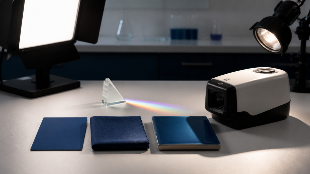
Blue is not one universal ingredient. This guide explains how light, materials, human vision and viewing conditions combine to create a blue appearance.
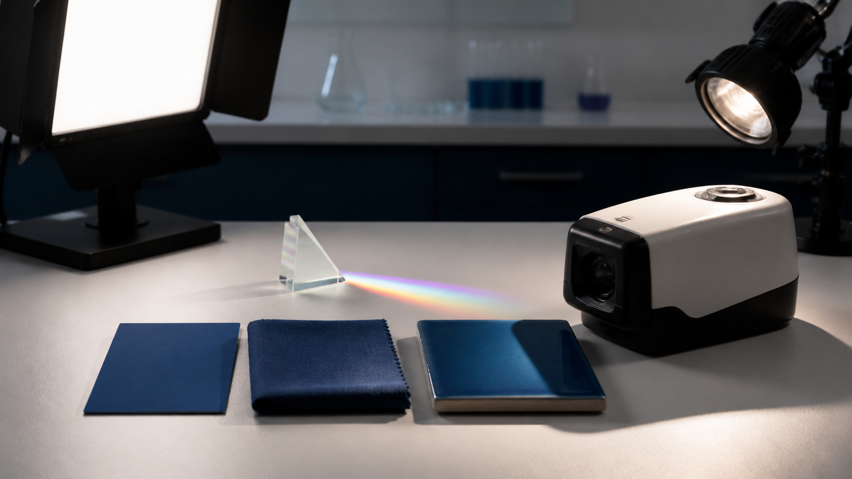
Something looks blue when the light reaching your eyes produces a blue perception. A screen or lamp can emit a blue-biased spectrum. A physical surface under white light usually absorbs some wavelengths and returns a spectrum that the visual system interprets as blue. The illuminant, material, viewing geometry, surroundings and observer all affect the result, so no single mixing recipe explains every blue.
The wording “what make blue colour” hides several different questions. A web designer may need RGB coordinates. A painter may need a pigment mixture. A textile buyer may need a fabric to match under store and daylight illumination. A physics student may be asking about wavelength. All can use the word blue, but the mechanisms and reliable tests are not interchangeable.
Blue is a result, not one recipe
Start by asking whether the thing is a light source or a material viewed under light. A display creates light with red, green and blue channels. A painted card does not have an RGB channel; it modifies light that strikes it. Air, liquids, thin films and microscopic structures can redirect, filter or interfere with light in still other ways.
| If the “blue” is… | The first question is… | A useful first test |
|---|---|---|
| A screen, LED or lamp | What spectrum does it emit? | Change the encoded channels or measure the emitted light |
| Paint, fabric, plastic or ceramic | What light reaches it, and what does it return? | View the sample under more than one controlled illuminant |
| A transparent or scattering medium | How do path length, particles and angle change the light? | Change the path or viewing geometry |
| An iridescent or structural surface | Does appearance depend strongly on angle? | Tilt the sample while holding the illuminant stable |
This distinction prevents the most common category error: applying a paint recipe to a display, or assuming a hexadecimal code is a complete physical specification for dyed fabric.
The physical chain behind a reflected blue
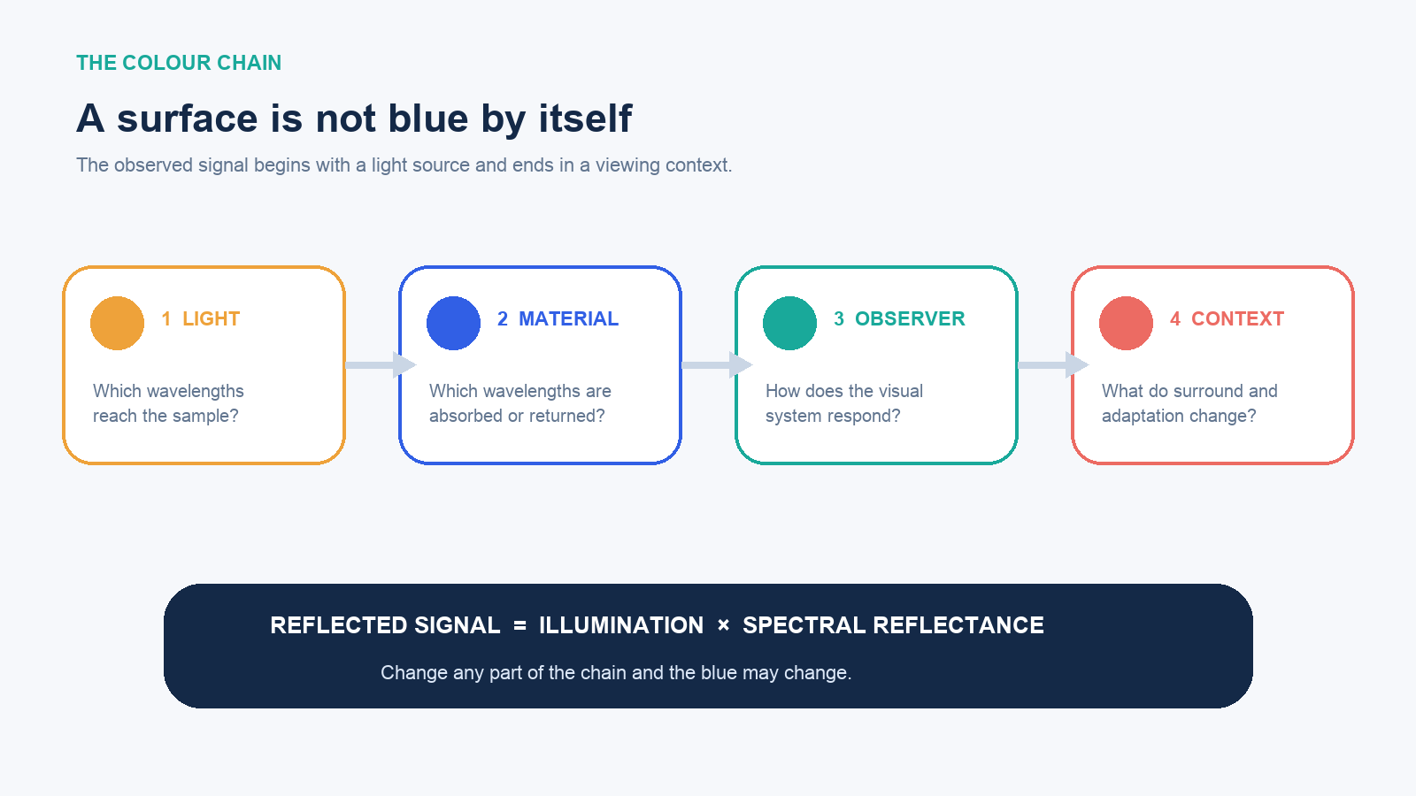
For an ordinary non-luminous object, a useful simplified relationship is:
reflected spectral signal = illumination spectrum × spectral reflectance of the material
This is not a metaphor. The NIST overview of CIE color measurement expresses the light stimulus from an object as the illuminant’s spectral distribution multiplied by the object’s spectral reflectance, wavelength by wavelength. CIE color-matching functions then convert the resulting spectrum into three tristimulus values for a defined standard observer.
A blue surface usually returns a distribution that stimulates the visual system in a way categorized as blue under the current conditions. That does not require the surface to reflect only one narrow “blue wavelength.” Real materials return broad, uneven spectra. Gloss can add a reflection of the light source; texture can change directionality; fluorescent materials can absorb at one wavelength and emit at another.
NASA describes the visible range as roughly 380 to 700 nanometres and shows that spectral colors separate by wavelength. That is useful for understanding a prism or narrow-band source. It does not mean every blue object is emitting or reflecting a single blue wavelength. Perceived colors can also be made by mixtures of wavelengths.
Four different mechanisms can end in blue
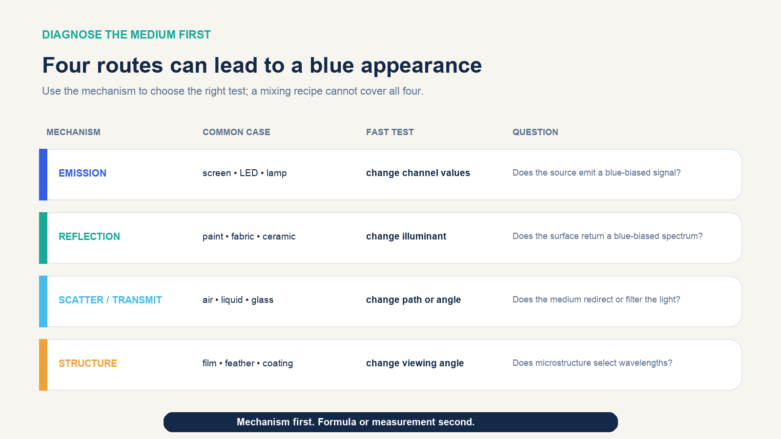
Emission is the direct route. A display or LED produces a spectral signal. In an sRGB interface, increasing the blue channel changes encoded coordinates, although the actual light still depends on the display, its calibration and the viewing environment.
Selective reflection or absorption is the familiar route for paint, ink, cloth, plastic and glazed ceramic. Colorants and material structure reduce some parts of the incident spectrum and return others. The result can be stable enough for ordinary use yet still shift under a different lamp.
Scattering or transmission changes which light reaches the eye through a medium and geometry. A liquid, haze, atmosphere or optical filter is not diagnosed like an opaque paint swatch. Particle size, concentration, path length, background and observation angle can matter.
Structural color and interference use microscopic geometry rather than only a conventional dye or pigment. Thin films, layered coatings and ordered structures can favor different wavelengths by angle, creating a blue that changes when the sample is tilted. If angle strongly changes the hue, a single front-view color code describes only one condition.
Why a blue object shifts under another light
A lamp cannot reflect wavelengths it does not supply. If a blue material has a high reflectance in part of the short-wavelength region but the illuminant is weak there, the object may appear duller, darker or shifted. Another lamp with a different spectral power distribution can make the same reflectance curve produce a different visual signal.
Colorimetry deals with this by specifying illuminants and observers. The CIE standard-illuminant specification defines Illuminant A to represent typical tungsten-filament lighting and D65 to represent average daylight for colorimetric calculations. These are defined reference distributions, not promises that every warm bulb or every patch of daylight is identical.
The observer and context also matter. The CIE definition of perceived color notes dependencies on the stimulus spectrum, size, shape, structure, surround, the observer’s adaptation and prior experience. A small blue chip surrounded by orange can look different from the same chip on neutral grey. A glossy sample viewed at a specular angle may show more of the lamp than the material’s body color.
Run a three-light diagnosis without a laboratory
This field test will not replace calibrated measurement, but it can reveal whether the problem is the sample, the illuminant or viewing geometry.
- Choose a neutral surround. Place the blue sample and an approved reference side by side on a matte grey or white area. Avoid colored walls and bright clothing near the comparison.
- Use three meaningfully different lights. Compare under diffuse daylight, a good-quality neutral white LED and a warm household source. Do not mix the lamps during each observation.
- Let your vision adapt. Spend a short, consistent interval in each condition before judging. Compare the samples together rather than relying on memory.
- Change angle deliberately. View both near perpendicular and at a shallow angle. Note whether gloss, metallic effects or iridescence dominate the difference.
- Record direction, not just “wrong.” Write whether the sample becomes greener, more violet, lighter, darker, duller or more saturated relative to the reference.
If the two samples match in daylight but separate under the warm source, suspect a spectral mismatch rather than inconsistent eyesight. If the difference appears only at one angle, inspect gloss and structure. If both samples shift together, the illuminant or adaptation may be driving the change. A phone photograph can document layout, but automatic white balance, exposure, tone mapping and the viewer’s display make it poor evidence of an exact color match.
Choose the level of specification the decision needs
“Blue” may be enough for a casual description. It is not enough for a brand system, approved product, manufacturing tolerance or cross-device reproduction. Match the specification to the consequence of being wrong.
| Specification level | What it controls | What it does not guarantee |
|---|---|---|
| Name or visual reference | General family and communication | A repeatable match across people, lamps or devices |
| RGB, HSL or hexadecimal value | A coordinate in a named digital color space | Identical emitted light on unprofiled displays |
| Physical master sample | An appearance target under agreed conditions | A match under every illuminant or angle |
| CIELAB values with illuminant, observer and geometry | A colorimetric target and difference calculation | Identical spectra or every appearance attribute |
| Spectral reflectance plus geometry | How a surface returns wavelengths under measured conditions | A complete description of texture, gloss or all human judgments |
The W3C’s CSS Color specification defines sRGB colors as red, green and blue coordinate triplets and supports other named color spaces. Those coordinates make digital intent explicit. An ICC profile helps translate color data between device-native spaces, but a profile must describe the relevant device state and workflow. A code without its color space is incomplete; a code with a color space is still not a promise about an uncontrolled screen.
For reflective products, record the illuminant, observer, measurement geometry, instrument settings, backing, sample conditioning and tolerance. NIST notes that modern materials can change appearance with illumination and viewing conditions, which is why color, gloss, haze and directional effects may need separate treatment.
Two blues can match and still be physically different
Two spectral signals with different shapes can produce the same three tristimulus values under specified conditions. CIE calls such stimuli metamers. This is useful—many displays and printing systems depend on color matches made from different physical spectra—but it also explains a common failure.
Imagine a dyed fabric approved against a printed paper proof under a daylight viewing booth. The dye and ink do not have the same spectral reflectance. Under that reference light, their integrated responses may be close enough to match. Under a warm retail lamp, the available wavelengths change, and the pair can separate: the cloth may lean violet while the proof leans green or grey.
The remedy is not to search for a more persuasive color name. Approve critical pairs under the illuminants that represent actual use, measure spectral data when metamerism matters, and use material-to-material masters where possible. A paper proof can communicate intent; it cannot reproduce every optical property of cloth, plastic, metal or glaze.
What mixing advice can and cannot tell you
A recipe is meaningful only after the medium is named. On an RGB screen, blue is an additive channel and pure encoded sRGB blue is a coordinate choice. In process printing, cyan and magenta are the relevant colorants, filtered through a press, ink, paper and profile. In an artist’s cyan–magenta palette, those pigments can move a mixture into a blue family. In food, a permitted blue colorant is normally the starting point rather than a mixture of non-blue dyes.
These answers do not contradict one another; they answer different systems. Trouble begins when a result from one system is transferred without its conditions. “Cyan plus magenta makes blue” is not a universal law that predicts a screen pixel, a textile dye bath, a ceramic glaze and a cake frosting. Every formulation also depends on the specific colorants, concentration, base material and process.
Common wrong turns
- Treating blue as a substance. Blue is a perceptual description; many spectra and mechanisms can produce it.
- Using wavelength as a complete object-color answer. A reflective object is shaped by an illuminant and a broad reflectance spectrum, not usually one wavelength.
- Approving from memory. Compare sample and reference simultaneously under controlled conditions.
- Trusting a photo as a measurement. Camera processing, file encoding and display rendering form another uncontrolled chain.
- Ignoring gloss and angle. Two samples can have similar body color but visibly different highlights and directional appearance.
- Publishing a color code without its space. “0, 80, 200” is ambiguous unless the encoding and range are defined.
- Testing under only one lamp. A one-light match can conceal metamerism that appears in the real environment.
The decision rule
When you next ask what makes a blue colour, answer four questions in order: Is the blue emitted or viewed on a material? What illumination and geometry apply? What observer or device interprets the signal? How close must the match remain across real conditions?
For a casual craft decision, a named medium and a side-by-side visual test may be sufficient. For a website, define the color space and test representative displays plus contrast. For a manufactured surface, approve a physical master under agreed illuminants and geometry. For a high-consequence match, use calibrated colorimetric or spectral measurement and a written tolerance.
That is the durable answer: blue is made by a system. Identify the mechanism first, control the conditions second, and only then choose the recipe, coordinate or measurement that belongs to the job.