
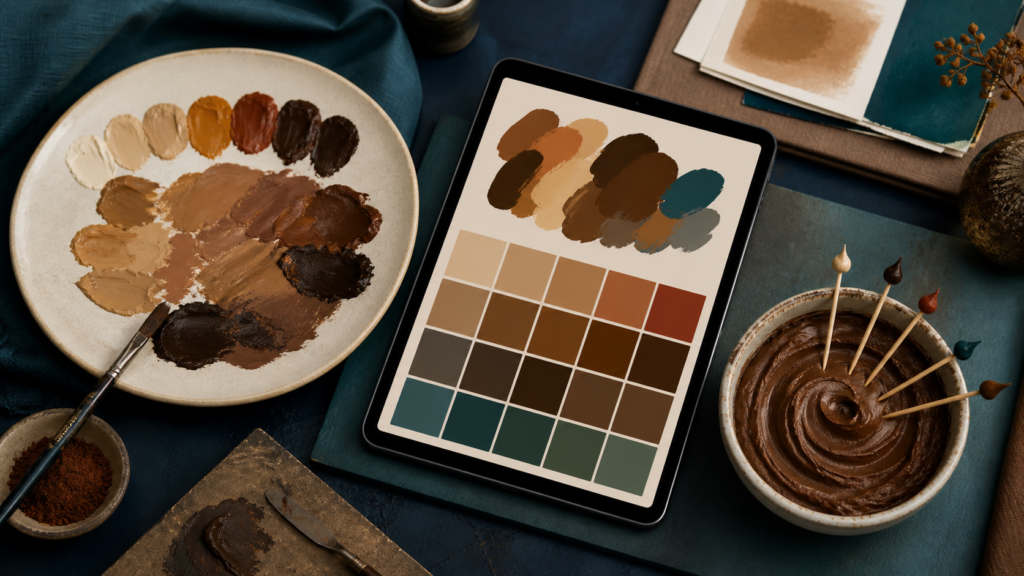
Use orange and blue for a controllable paint mix, direct color values for screens, and food-safe gel for icing—then correct in small measured moves.
To make brown paint, start with orange and add blue a little at a time. You can make the orange first from red and yellow, then neutralize it with its complement. For a warmer brown, keep more orange or red in the mixture; for a cooler brown, add slightly more blue.
That recipe is for physical paint. Digital color and edible icing behave differently, so choose the section matching the material in front of you.
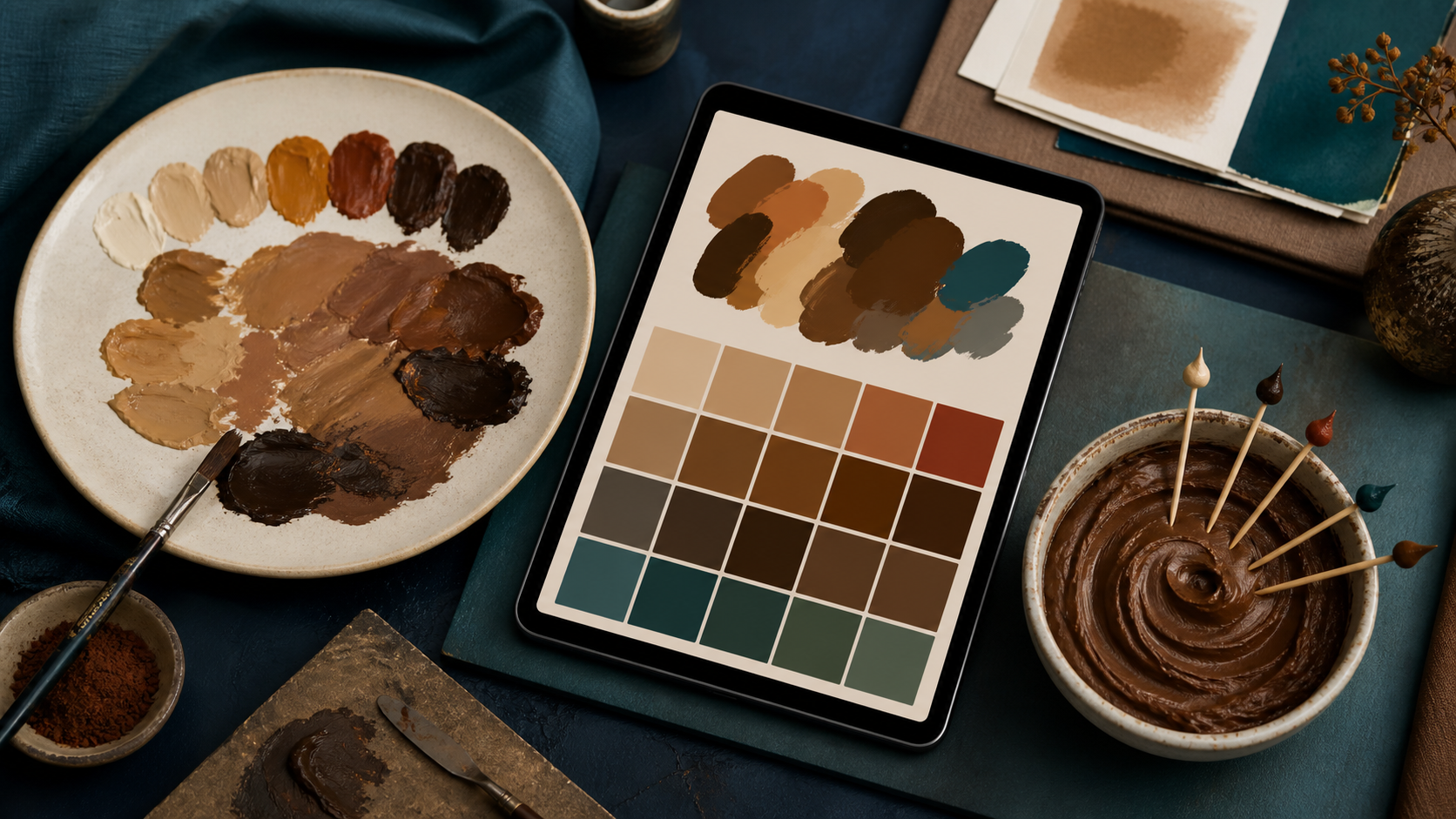
Pick the recipe for your medium
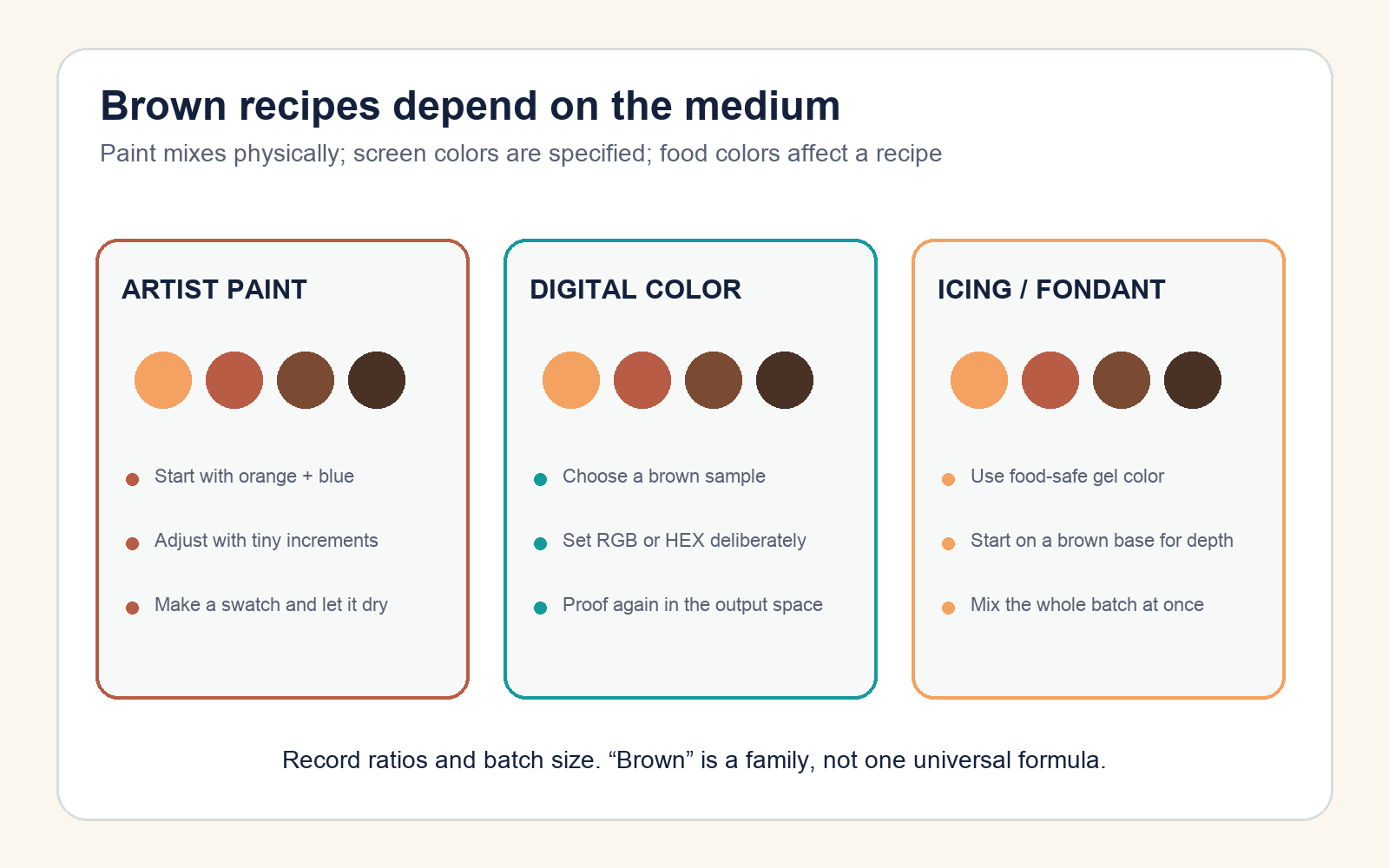
| Medium | Reliable starting point | Control that matters |
|---|---|---|
| Acrylic, oil, or gouache | Orange plus blue | Pigment identity, tinting strength, opacity, and dry color |
| Watercolor | Transparent orange or earth color plus blue | Pigment ratio, water dilution, paper, and granulation |
| Digital screen color | Choose an RGB/HEX value for the target brown | Color space, display, contrast, and export |
| Print design | Build and proof in the required CMYK workflow | Profile, paper, ink limit, and physical proof |
| Icing or fondant | Food-safe brown gel, added gradually | Base color, batch size, consistency, resting shift, and taste |
Make brown paint with a repeatable test
- Place a larger amount of yellow and a smaller amount of red on the palette; combine them into orange.
- Put blue on a separate edge of the palette. Add only a pin-tip or brush-tip amount to the orange.
- Mix completely, spread a small swatch, and judge it beside the colors it will accompany.
- Repeat with measured additions until the mixture reaches the needed hue and darkness.
- Record the paint names and rough ratio, not merely “red + yellow + blue.”
Blue and orange are complementary regions on a traditional painter’s color wheel. Golden Artist Colors explains that mixing complements reduces chroma and can move toward a gray or black; in real pigments, bias and strength determine whether the result becomes a useful warm brown, cool brown, or near-neutral.
There is no universal 1:1 formula. Phthalo blue can overwhelm a weak orange, while a lower-strength blue may require much more. Make the first batch small and add the stronger pigment to the weaker mixture.
Alternative two-color pairs
Other near-complementary pairs can produce chromatic neutrals:
- Red + green: often useful for dark reddish or earthy browns.
- Yellow + violet: can create ochre, olive-brown, or muted neutral mixtures depending on pigment bias.
- Burnt sienna + ultramarine blue: a familiar practical pair for a range from warm brown to dark neutral.
Golden’s Just Paint guidance recommends beginning tests with only two paints and recognizing that each red, yellow, or blue has a hue bias. Fewer ingredients make a failed mixture easier to diagnose and reproduce.
Correct the brown you already mixed
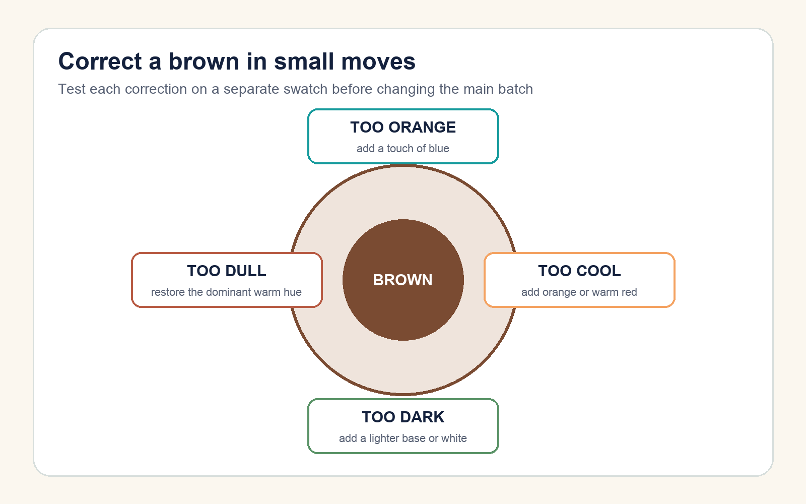
- Too orange: add a trace of blue.
- Too cool or greenish: restore warmth with orange, red-orange, or an earth red.
- Too purple: add a yellow-orange bias cautiously.
- Too dark: mix part of it into fresh lighter base paint, or add white if a lighter, less saturated tint is acceptable.
- Too dull: do not keep adding all three primaries. Restore a little of the hue that should dominate.
Test corrections on a side swatch. If the target is light brown, build a new light base and add the dark mixture into it; trying to rescue a large over-darkened batch with white can consume material and create a chalkier color.
Make brown in digital design
On a screen, you do not need to simulate pigment mixing. Specify the target directly. Example starting values include:
| Brown | HEX | RGB |
|---|---|---|
| Warm cocoa | #7A4B32 |
122, 75, 50 |
| Dark espresso | #493126 |
73, 49, 38 |
| Light tan-brown | #B88963 |
184, 137, 99 |
These are starting values, not universal named standards. Evaluate text contrast and UI states rather than choosing by the word “brown.” For print, convert through the document’s required CMYK profile and inspect a proof; identical numeric recipes can appear different across screens, profiles, inks, and paper.
Make brown icing or fondant
Use only coloring sold for food. A concentrated brown gel is the most controlled shortcut because it adds less liquid than ordinary liquid coloring. Wilton advises adding small amounts with a toothpick, mixing completely, and adding more gradually. Its guidance also recommends starting with chocolate icing or brown fondant when a deep brown is needed.
Color enough for the whole project because a shade can be hard to duplicate. Let a test portion rest before the final adjustment: buttercream colors may deepen over several hours, and baked batter can shift lighter. If excessive coloring affects taste or texture, use a naturally brown base instead of forcing white icing darker.
Document the result
Save a dry swatch or export reference, note the material brands or color space, write the ratio and batch size, and view the result under its final lighting. Brown is relational: the same swatch may look warmer beside blue, cooler beside orange, and different when glossy, matte, wet, or dry.
The useful rule is: start with a medium-specific base, add the neutralizing color in small measured steps, and record the successful recipe before making the full batch.